A lot of my job involves making logos for individuals and companies that reflect their personality, unique value proposition and the brand as a whole. It is important for me to understand the people behind the logo; what they do, what services and products they provide and who they are, as special, one-of-a-kind people.
Since starting out as a freelance designer, I have developed a process that helps me to get into the minds of my clients to determine what they want and need. A designers process is unique to their practice, but I have simplified my process to a point where you can emulate what I do. It's a three step process to creating a logo that looks like this:
STEP 1 | I get to know my new client by asking them to fill out a New Client Workbook. The workbook has a range of questions: some that are designed to get to know the market this brand will operate in, like "What is your target market, who would you like to be targeting that you aren't already?" and others that help me to understand what the client is looking for, like "Aesthetically what are you drawn to? What colours, patterns, shapes, typefaces?" and "List companies whose branding you both love and loath."
STEP 2 | After reviewing the workbook, I create my own Pinterest board and collect images and example of branding that help to clarify the brand direction I will be proposing to my client. From here I create a moodboard that reflect my ideas for the branding.
STEP 3 | Once I have a good idea of the brand personality and direction I will take the brand in, I create four initial logo designs to present to the client and then from here we narrow down the choices and really start to see the brand identity emerge.
So as you can see here, the cornerstone of a strong brand is a strong logo. Of course, hiring a brand designer will ensure that this cornerstone is set firmly in place, however I know we can't all afford a designer, especially when we are just starting out with our brands!
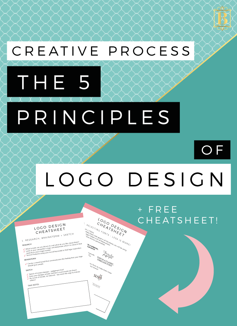
The good news is, if you want to DIY your logo, I have the 5 principles you need to keep in mind!
1. RESEARCH, BRAINSTORM + SKETCH!
The very first principle of logo design is to do your homework. This is why I take the time to ask my new clients a range of questions that help me to understand the product or service, the market and the person behind the brand! Taking this time to research and brainstorm is crucial! But how do you conduct this kind of research and brainstorming?
- Consider brands that you, as an individual are drawn to - what elements appeal to you? Is it something about the colours, shapes, textures? What feelings go these brands create for you.
- Check out your biggest competitors - the brands, businesses and blogs that your target market is drawn to. Look at their brand aesthetics and what it is about those brands that really make them stand out. Perhaps even talk to your target market and ask them what elements of their favourite brands attract their attention.
- Browse Pinterest and find images that give you the same feeling that you hope your brand will - save them all in one place like a secret Pinterest board so you can see all the images together. Find a range of different images - photographs, illustrations, graphics, typography, quotes, textures and patterns.
- Create a moodboard from these images that captures the feeling of your brand.
Once you have a firm grasp on your brand concept, start to design your logo. I recommend creating 4-6 initial designs and remember: keep it simple and don’t overcomplicate it! This is one point where DIYers often slip up, they will try to create something complex when really something clean, crisp and relevant will be far more sustainable in the long run. I also recommend sketching these design ideas out on paper before you turn digital.
One tip though when designing your logo - don't follow trends. While I encourage you to be relevant, I also don't want you creating something that has a shelf life - and often following trends will ensure a shelf life! Following trends also unfortunately means that you might inadvertently imitate the work of others, and we don't want that!

2. SELECTING FONTS - LESS IS MORE
When you are designing your logo, 99% of the time you will need to select fonts and this can be a stressful part of the whole process! But like I said in the last section, this can be overwhelming because people tend to overcomplicate it!
I recommend picking 1-2 fonts for your logo. Choose more fonts than this can create a really messy look if it isn't done properly - and in my opinion, that kind of complexity is better left to the professional designers. Keeping it simple and selecting only 1 (or max, 2) fonts will make it easier to be conscious of how your text will look across different communication points and at different sizes. We will talk more about sizes soon, but when I say 'communication points', I mean, how will this font work on your website, on your business cards or even on your packaging?
Other considerations to remember when it comes to selecting your fonts is first the character of the font you are choosing. Let’s look at the character of some fonts:
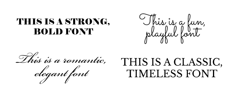
Elephant | Sacramento | Bickham Script | Libre Baskerville
Some fonts are strong and solid, giving an authoritative feeling of stability and boldness. While others give more of a feeling of fun and playfulness. Considering these font personalities and comparing them against your brand personality is a great way to ensure consistency across this element of your branding.
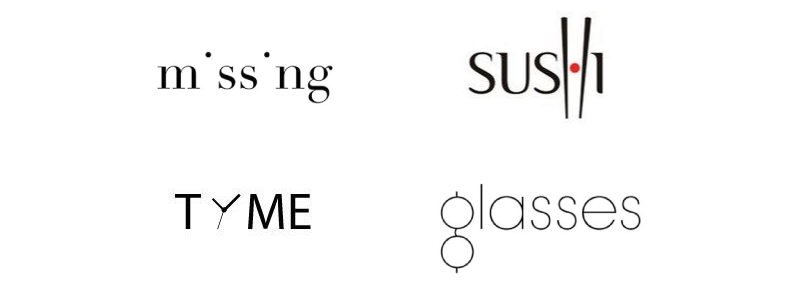
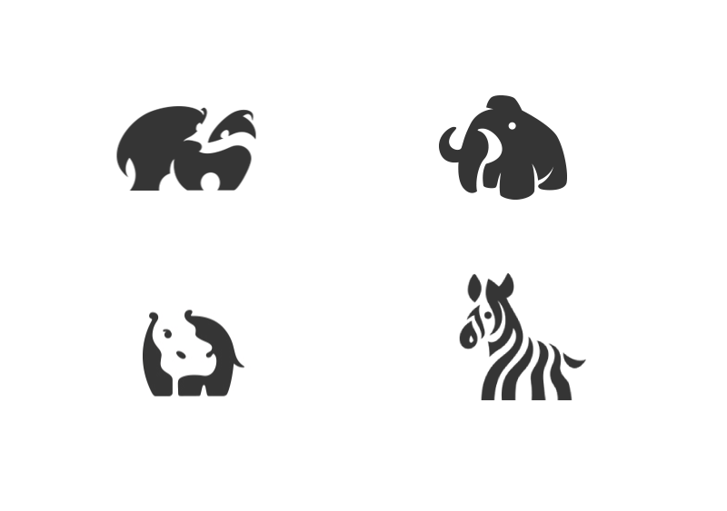
Remember you can always adapt a font too and changing the structure of letters can be super effective in giving your logo font character! So for example, you will notice clever little ways these brands have altered specific letters to make quirky, unique logos!
3. SPACING + COMPOSITION
When considering the image that your logo creates you will need to consider the space you are using. Or rather, the space you are not using. One of the key principles in creating a successful logo is to pay attention to the space within and around it.
So by this, I mean the area that the image, icon or text occupy as well as the space that is left blank - we call this negative space.
As you can see from the examples above, the space you don't use can be just as important as the space that you do use. So consider the role of negative space in your logo design.
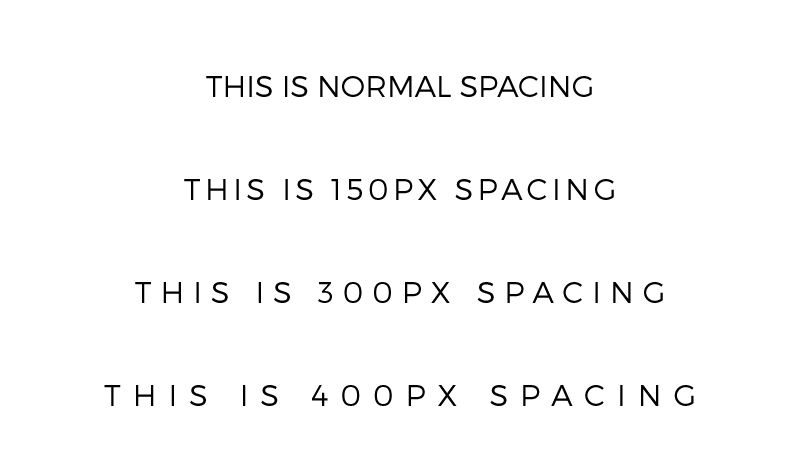
Another situation that spacing plays a role in your design is letter-spacing. Now, I am a huge fan of letter-spacing and all good graphic software will allow you to change the space between letters in your words. Giving the letters some space can drastically change the appearance of a word. Here's an example of how letter-spacing can completely change the feeling of a word using the exact same font:
4. BE MINDFUL OF SIZING + CLARITY
Remember that your logo might be used at different size points and you want to ensure that it is still legible at these different points. So, the issue here is that sometimes when you reduce the size of a logo it becomes difficult to read and distorted. This is particularly the case when you logo has a lot of finer details.
To combat this issue, make a list of all the places you might use your logo. Here are a few ideas:
- ONLINE | Social media, email signature, website header, landing pages, registration pages, webinars, avatar images, profile images, newsletter header, image watermark.
- PRINT | Business cards, letterhead, packaging, tags, signage, clothing/uniform, welcome packs, labels, books, notepads and stationary.
Once you know the range of places you might use your logo, determine the size of these places and test your logos at the different size points to ensure it will work properly.

5. CREATE LOGOS THAT ARE ADAPTABLE
(ALTERNATIVE LOGO VARIATIONS)
One thing that I love to do with my logo designs, is create logos that allow for variations. This means creating a brand identity that is adaptable and versatile, with logo variations that can be used in different places.
Knowing where you might use these variations is the key to creating them successfully, so before you start your logo design, brainstorming all the places you might use a logo and if there are any specific requirements, is a great idea (see the list of possible places you might use your logo above). For example, determine if you need a logo variation that is square for use as your social media profile images, or if you need a logo to be white in order to overlay over images as a watermark. Knowing how you will use variations upfront is key in creating meaningful alternative logos and having this in mind when you start your logo design process will ensure you are creating a cohesive and consistent brand.
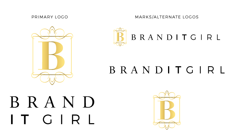
Here's an example of the Brand It Girl logo and variations. As you can see, they all work together as a cohesive brand logo team, but the different variations give me options to use at different communication points.
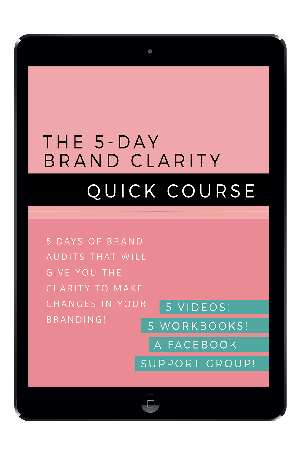
DOWNLOAD THE LOGO DESIGN CHEATSHEET!
Let's take the guess work out of designing logos with this cheatsheet - re-capping on the 5 principles of logo design + questions that will get you clear on exactly what you need when designing your next logo!
Don't forget to leave a comment (with your link so I can visit you back!) and let me know what you find most challenging about designing logos! Or if you don't design then, tell me what you do and don't like about your current logo!