When Sandra and Jim approached me to design a new brand identity for their Victorian holiday cabins, I was absolutely thrilled! I had never designed for an accommodation company before and I loved their easy going, kind vibe right from the start. So I knew that this would be a great project to sink my teeth into!
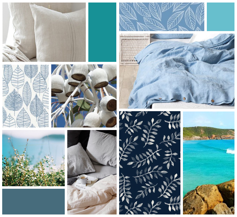
Sandra and Jim took over what was Prom Gate Vista Cabins and discovered that the branding was a shambles. They wanted something clean, crisp and relaxing that reflected the essence of their holiday cabins, and so we started off with a mood board that reflected the feelings that they wanted their brand to evoke. We used a range of blues and turquoise colours, along with imagery of the Australian bush and the gorgeous Wilsons Prom. They wanted this element of nature to be at the forefront of their new brand and so it featured heavily in the mood board and eventually, the logo.
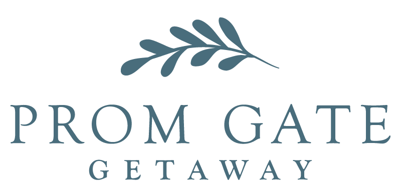
After creating the mood board, the leaf motif really stood out as a design element that fitted the brand aesthetic. I wanted to create an icon that would symbolise not only a leaf but also coral or ocean vegetation in order to be the perfect balance of bush and ocean. I gave Sandra and Jim four initial logo designs as you can see here:
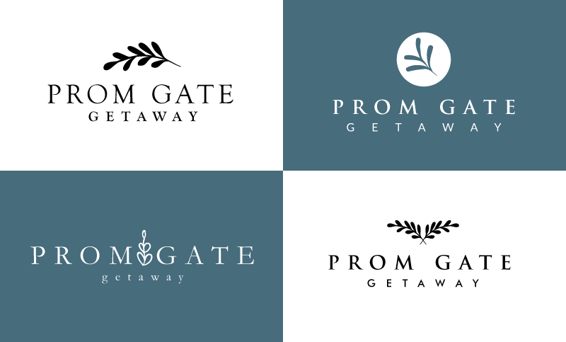
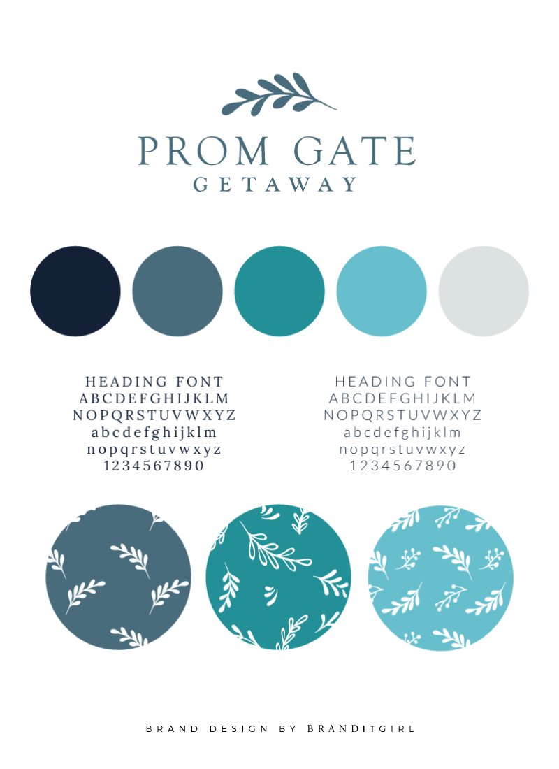
Instantly Sandra and Jim fell in love with the first design and no revision rounds were necessary. They knew the moment they saw it that it was the one for them and we moved quickly onto the brand board. The brand board used the colour palette proposed in the original mood board along with a deeper navy blue and a light creamy grey.
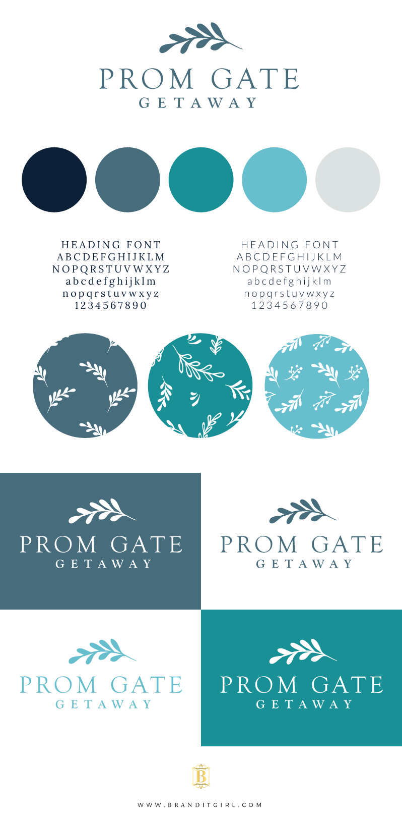
I selected two different fonts for the brand, using a serif and sans-serif combination. I also created a range of pattern designs using the central leaf motif as the basis.
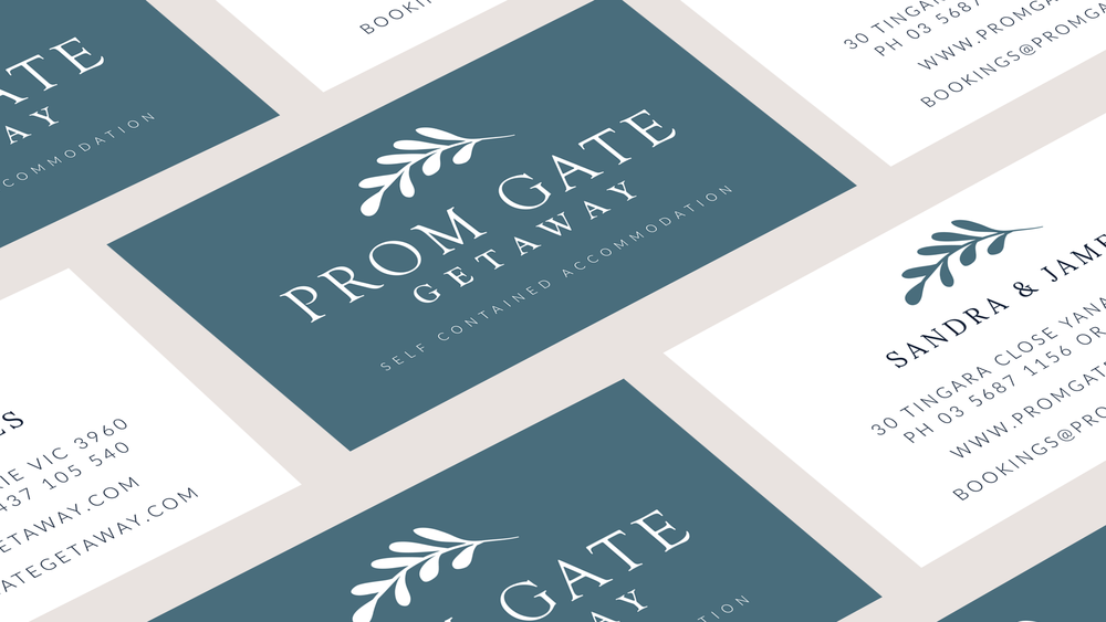
Once the brand board was finalised I created Sandra and Jim a set of business cards. Sandra loved the idea of keeping the business cards simple and clean, so we opted for a solid background on the front with white on the back. It was the perfect addition to the brand identity.
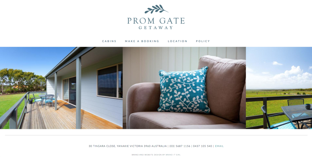
The last piece of the puzzle was to create a brand new website for this new brand. Again, the brief was to create something simple and clean that showcased the natural beauty of this holiday destination.
Of course, the website is built on Squarespace. It makes it so simple for Sandra and Jim to make changes whenever they need to and it's mobile responsive too. Two things that were very important to these clients.
I am sure you will want to have a look at the site yourself! So head on over and have a browse - and totally book a cabin at this gorgeous place if you are ever in Victoria, Australia!
Sandra and Jim were two of the kindest people I have ever worked for! I can't wait to see what they do with this new brand and I am very much looking forward to heading down to Vic for a visit!