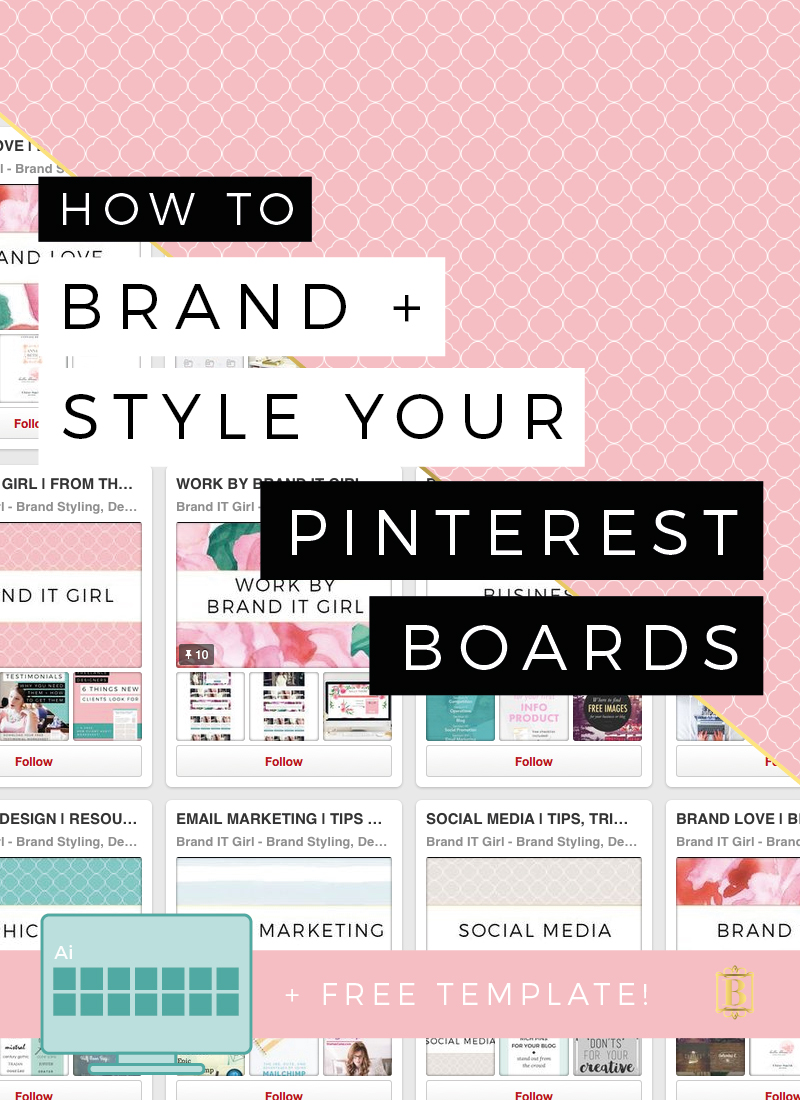
I am sure you have seen those Pinterest accounts that just kind of blow you away with consistency, clarity and the pretty branded board covers. Accounts like these don't just materialise out of nothing. There is a lot of time and effort put into these boards and the strategy behind them.
I have recently started to research how to use Pinterest more efficiently to help my business and blog to grow, while simultaneously helping other people by providing them with what I believe to be quality information. One of the big things that is coming up again and again in my research is how important it is to have branded Pinterest boards that has a clear strategy and message to communicate.
Here's the thing - you can't keep looking at your social media as separate to your website. That is the entirely wrong way to use social media and it's not helping you one little bit. You invest so much time and energy (and often money) into growing your brand and interacting on social media, so why not maximise your resources to ensure you are getting the return you deserve. Keeping brand consistent as you cross over to social media from your website is not only vital, it's actually not that difficult either!
Let's look at the best ways to brand and style your Pinterest boards:
1. DETERMINE WHAT YOUR ACCOUNT IS FOR AND DECIDE ON LOGICAL BOARDS
Here's a common misconception: "the more boards I have on different topics, the more people I will attract". Wrong.
Just like we talk about niching and narrowing the focus of your blogging topics/categories as a way of building a strong blogging brand, so too should we narrow the focus of our Pinterest boards. Think about what your business and blog is about and create boards that relate to your chosen niche. There is no point having 'automobile maintenance' boards if you are an interior designer, for example. This only confuses fellow Pinners and will ultimately send them on their way. It dilutes your brand.
One great way of deciding on what boards you should include is to look at your blogging categories. For me, I have six blogging topics: Blogging, Branding, Business, Design, Productivity and Web Design. These six topics make up six of my boards. I also have Social Media, Photography, Email Marketing, Workspaces and Brand Love. What do all these topics have in common? They are 100% relevant to my target audience. There is no recipe boards or hair style boards thrown in there. They are all on brand for my target market.
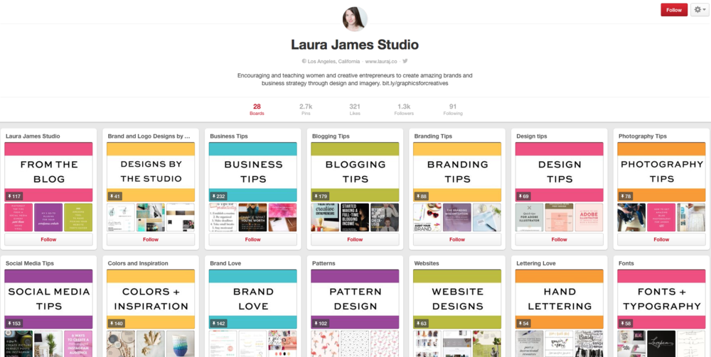
Laura James Studio does this particularly well. All of her boards are relevant to her target market and she doesn't make any exceptions.
2. PAY ATTENTION TO WHAT YOU PIN
When you are pinning images to your boards, I recommend looking for pins that fit in with your overall brand aesthetics. Sure there will be variations in colour and composition but keeping a general, overall feeling to your boards will really help to attract pinners and keep them interested. I know it sounds harsh, but avoid ugly pins. You know the kind I am talking about, the blurry, slightly fuzzy, the mismatched fonts and weird colour pairings - just steer clear of them. Don't forget that you also have secret boards that you can set up to include the less attractive pics, so if you find a killer article with an image that kinda 'kills' the mood, save it to a private board instead!
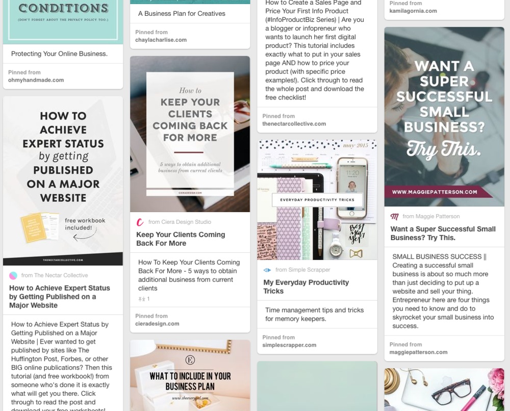
Here is a snippet of my Business Board, as you can see the image aesthetic is fairly consistent. They don't overly conflict with my own branding and all the pins are on topic!
3. STYLE YOUR BOARD COVERS TO MATCH YOUR BRAND
One thing I love to see on Pinterest is board covers that are styled to match your brand. Let's look at some people that do this really well!
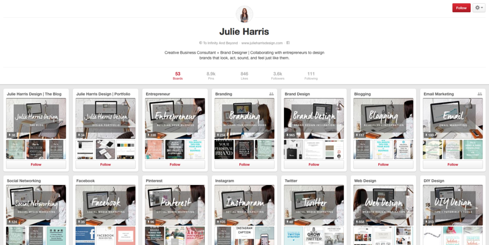
I particularly love what Julie Harris has done with her board covers. It is very clearly on brand and utilises similar images in the background of each board cover.
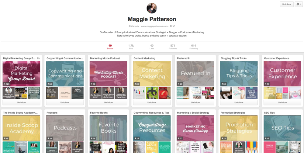
Maggie Patterson uses a set colour and font pattern to mix and match, creating a cohesively branded theme for her Pinterest board covers. She selects different images and then places a coloured wash over the image before placing text over the top. This creates a very clear brand identity.
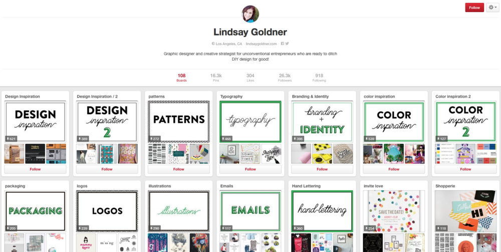
If you are feeling really creative, you can follow Lindsay Goldner's lead and create completely unique cover photos for each different board. This is slightly more time consuming but creates a great effect! Just make sure you stick to similar colours and fonts!
It doesn't take long to create these board covers and they are super easy to put into place! Board covers display at 217px X 146px but I generally create my board covers 2x bigger, so 434px X 292px. Do you use Adobe Illustrator? I have a surprise for you! Scroll down for my FREE Illustrator template. I also recommend saving your cover images as PNGs, but JPG will work too.
I thought I would show you a little before and after so you can see for yourself what a difference this small thing can make to your overall Pinterest account!
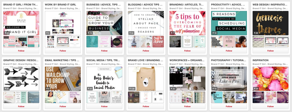
As you can see, the topics were consistent and clearly relevant to my target market but the visual was all over the place! Some of the covers were my branding but not on purpose! There was a mishmash of colours, fonts and images and it felt really cluttered and inconsistnent.
So to add your own custom cover photos, open your board and click on the Add A Pin option to the left. Upload your new pin and then go back to your main Pinterest page. Click on the Edit button at the bottom of your board icon and a popup will open with the option to change your cover image. The cover option is half way down the panel, just click on Change. It should display the last image you uploaded/added to your board, so that should be your custom cover photo. If not, just scroll through until you find it and save both the change of image and the edit panel. Your new cover photo should appear! Here is my board all branded. It makes a huge difference and is far more relevant to my brand!
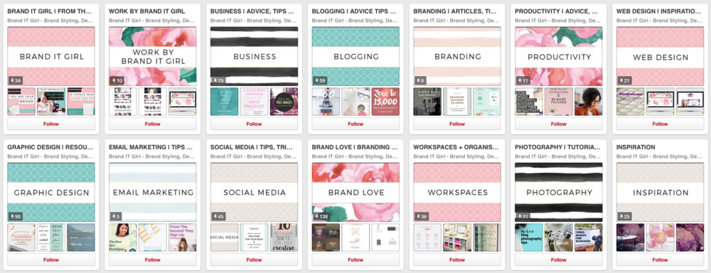
What do you think? It makes a pretty big difference and is definitely more pleasant on the eye! I have saved the Illustrator file I used to create this so if I need to replace any of the images in the future, I don't have to try to match these images - it's all still there, and all I need to do is edit them images if needed!
So what are you waiting for!
What do you need to get started on your own branded Pinterest covers?
- Illustrator (and you can use my template below), Photoshop or even use PicMonkey or Canva
- Your brand fonts, colours and elements.
- Backgrounds or you may decide to create solid coloured backgrounds.
- Half an hour and a bit of imagination!

