3 Pinterest Hacks To Try Right Now! With Zoe Linda

“I don’t GET Pinterest!”
“How do I get more repins?”
“Pinterest just doesn’t work for me!”

As a social media strategist, these are things I hear on a daily basis. Pinterest seems to simultaneously be major source of confusion AND the best place to grow your blog online. Pinterest is a goldmine of new audiences to reach and has, hands down, been the reason for my recent blog growth. If used correctly, Pinterest can be your new BFF too!

I’ve got 3 quick Pinterest hacks for you try right away but they all revolve around one fact: Pinterest is NOT a social media platform, it is a search engine.

Pinterest is NOT a social media platform, it is a search engine.

Pinterest, and it’s algorithms, work the same way as Google does. If you search for a topic on Google, you are going to see the best results for that topic. It’s the same on Pinterest. If you’re searching for ‘wedding reception ideas’, you’re going to see the best pins first. You need to treat your Pinterest account like you do with your blog posts and SEO the heck out of it! Keep reading to see my top tips on how to do this and grab your free e-book on how to find the best keywords for your Pinterest account!


1. ADD KEYWORDS INTO YOUR PINTEREST NAME

If you have a specific service or product, it’s great to showcase this in your Pinterest profile name. Choose one or two keywords that your audience might be searching for on Pinterest to add into your name and you’ll find yourself popping up more in search results!

Here’s a screengrab of my profile on Pinterest.
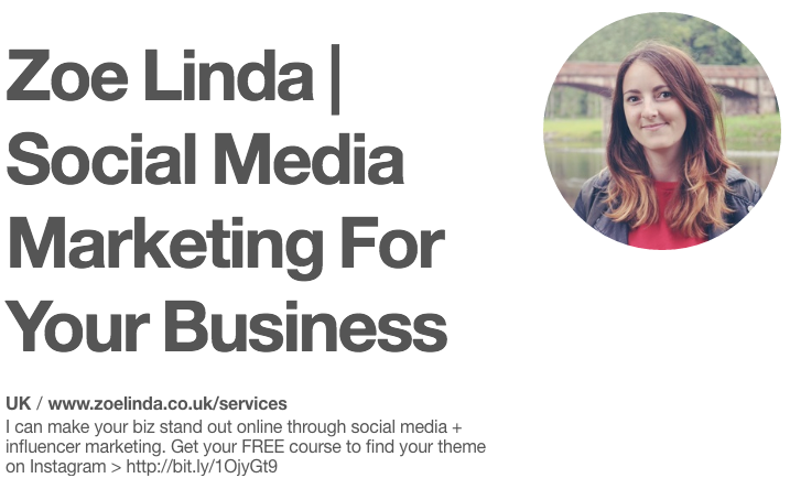


If someone searches for ‘social media marketing’ or ‘business marketing’, there’s a chance my account will pop up!

Top tip: Your profile name is what shows up in someone’s notifications when you interact with their account. This is a chance for you to quickly tell them who you are! For example, my Pinterest name says exactly what I do. If I follow someone that needs social media help, they might see my profile name and think “Hey! That’s exactly what I need right now!” Make sure you get your name right!

Take Action: Check out your Pinterest profile name. Does it tell new followers who you are and what you do in an instant? Does it include at least one keyword for your industry/niche?


2. WRITE ENTICING + KEYWORD-FRIENDLY PIN DESCRIPTIONS

Add relevant keywords into your pin descriptions to increase the chance of your pins showing up in search results. Don’t go overboard on keywords though - you want to keep your pin descriptions engaging and personable.

For each of my pin descriptions, I add the name of my blog post (for extra keyword goodness) and trickle key phrases into my copy. Here’s an example of a pin description for my blog post all about naming your biz.


Notice how I’ve included my ideal audience? By adding the phrases ‘creative entrepreneurs’, ‘bloggers’ and ‘small business owners’, my pin is much more likely to be seen by exactly these peeps!

I’ve also added a CTA to my pin to encourage pinners to click through to my blog post.

Take Action: Take a look at the pins saved from your blog. Have you included a description? If you have, does it include the following things?

  • A call to action - ‘click through to…’, ‘don’t forget to save this pin’, ‘share this pin’, etc.
  • Keywords focused on the topic of the blog post.
  • Keywords or phrases your target audience might be searching for.

Don’t forget to grab your free Pinterest keywords e-book at the end of this blog post!


3. GO KEYWORD CRAZY IN YOUR BOARD DESCRIPTIONS

Now forget everything I just told you about being engaging and personable. When it comes to board descriptions, you can go all out! No one really reads board descriptions, do they? ;)

Make the most of your chance to add as many keywords and phrases as possible that relate to your board. This will have a huge effect on the reach of your boards.

Use my free e-book below to find the best keywords for your Pinterest profile then literally dump them all into your board descriptions. I mean, look how overboard I went with mine…
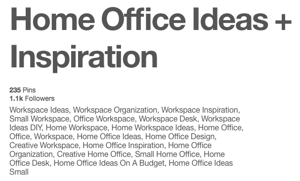


Crazy, right?

Maybe not. This is my most popular board on my Pinterest account and reaches over 210,000 people a month.

Take Action: Download my free Pinterest keywords guide and spend some time finding the best keywords for your boards. Once you’ve got a good 10 to 20 keywords and phrases, add them to your board descriptions and watch your reach increase over the next 30 days!


I really hope these 3 Pinterest hacks will help you to grow your account and get your blog + biz seen by new Pinners! Do you have any questions about Pinterest? Pop them in the comments below and I’ll do my best to help you out!

Download your FREE Pinterest Keywords Guide

Screen_shot_2016-08-19_at_15.36.14

Sign up here to grab your free e-book!

I hate spam - don't worry, your email is safe! Powered by ConvertKit

Zoe Linda is a social media strategist and influencer marketing expert. Zoe helps passionate small business owners stand out online and help them along their exciting biz journey! She also blogs about blogging, social media, and business over at zoelinda.co.uk.

If you need help with your Pinterest strategy, take a look at Zoe’s Pinterest Makeover package on her site!
PINTEREST | INSTAGRAM | TWITTER | FACEBOOK

Portfolio: Prom Gate Getaway

When Sandra and Jim approached me to design a new brand identity for their Victorian holiday cabins, I was absolutely thrilled! I had never designed for an accommodation company before and I loved their easy going, kind vibe right from the start. So I knew that this would be a great project to sink my teeth into!


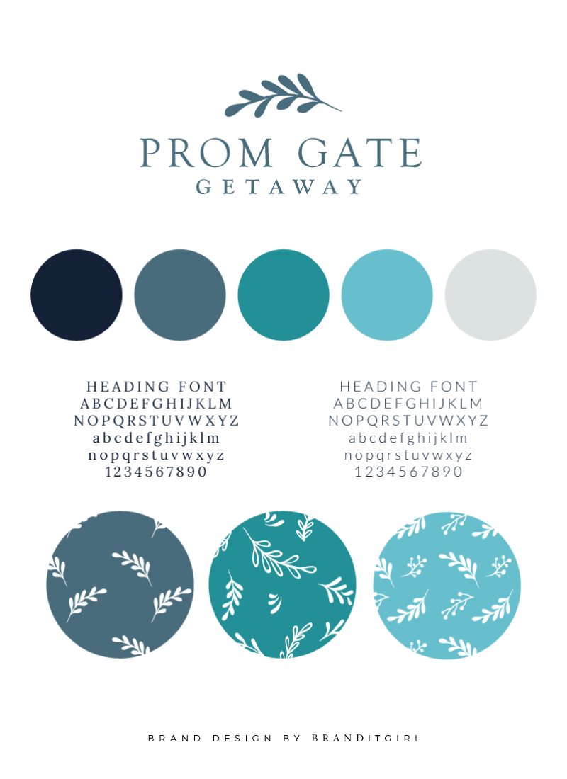
Sandra and Jim took over what was Prom Gate Vista Cabins and discovered that the branding was a shambles. They wanted something clean, crisp and relaxing that reflected the essence of their holiday cabins, and so we started off with a mood board that reflected the feelings that they wanted their brand to evoke. We used a range of blues and turquoise colours, along with imagery of the Australian bush and the gorgeous Wilsons Prom. They wanted this element of nature to be at the forefront of their new brand and so it featured heavily in the mood board and eventually, the logo.


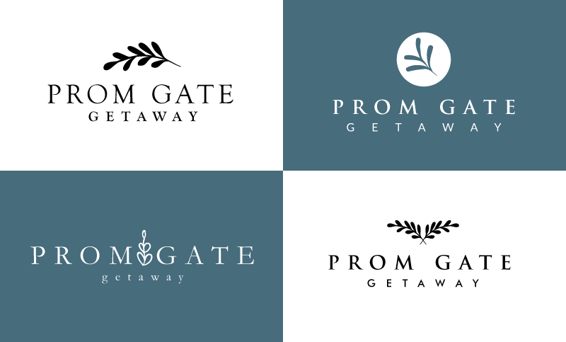
After creating the mood board, the leaf motif really stood out as a design element that fitted the brand aesthetic. I wanted to create an icon that would symbolise not only a leaf but also coral or ocean vegetation in order to be the perfect balance of bush and ocean. I gave Sandra and Jim four initial logo designs as you can see here:


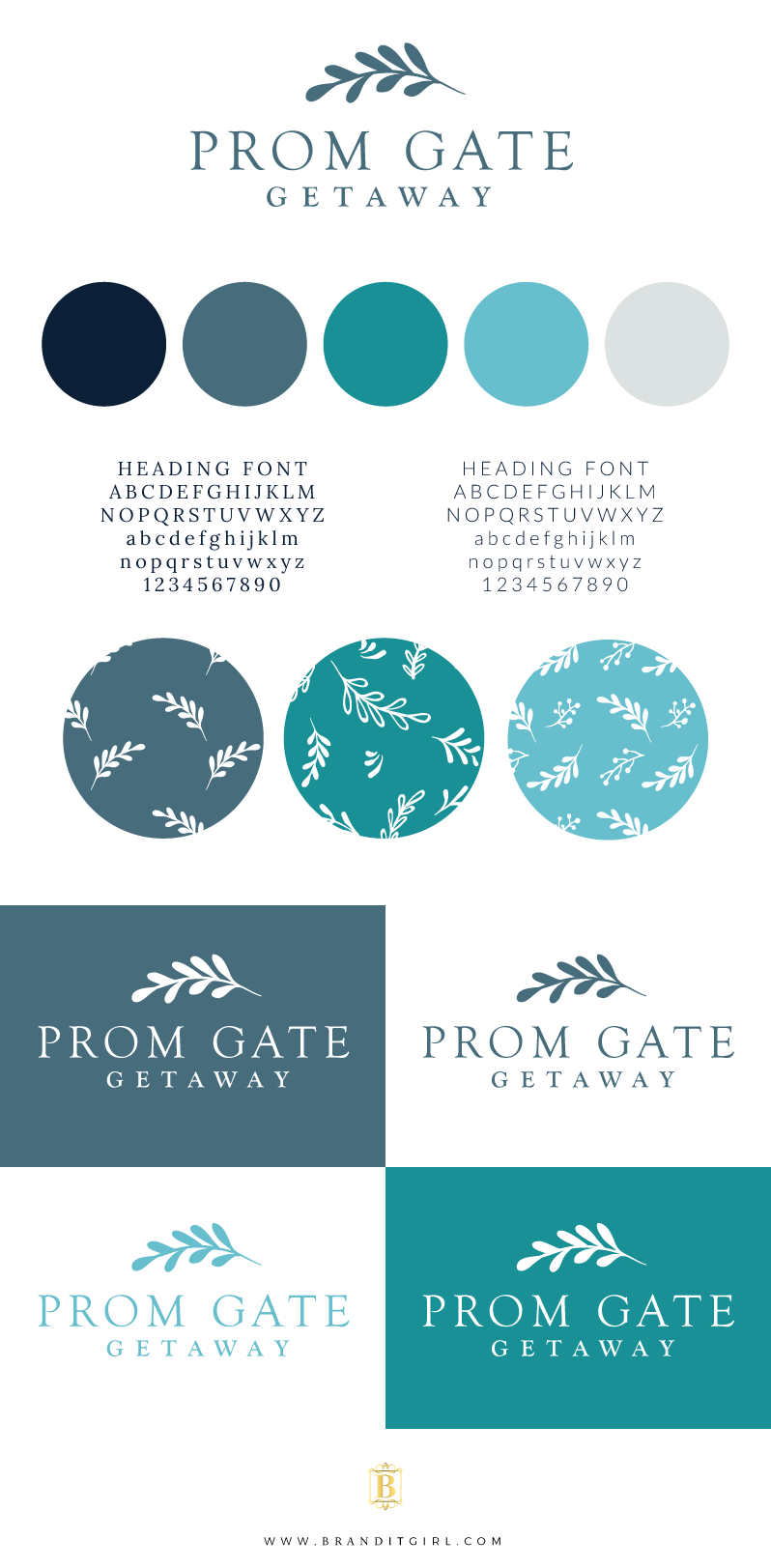
Instantly Sandra and Jim fell in love with the first design and no revision rounds were necessary. They knew the moment they saw it that it was the one for them and we moved quickly onto the brand board. The brand board used the colour palette proposed in the original mood board along with a deeper navy blue and a light creamy grey.

I selected two different fonts for the brand, using a serif and sans-serif combination. I also created a range of pattern designs using the central leaf motif as the basis. 


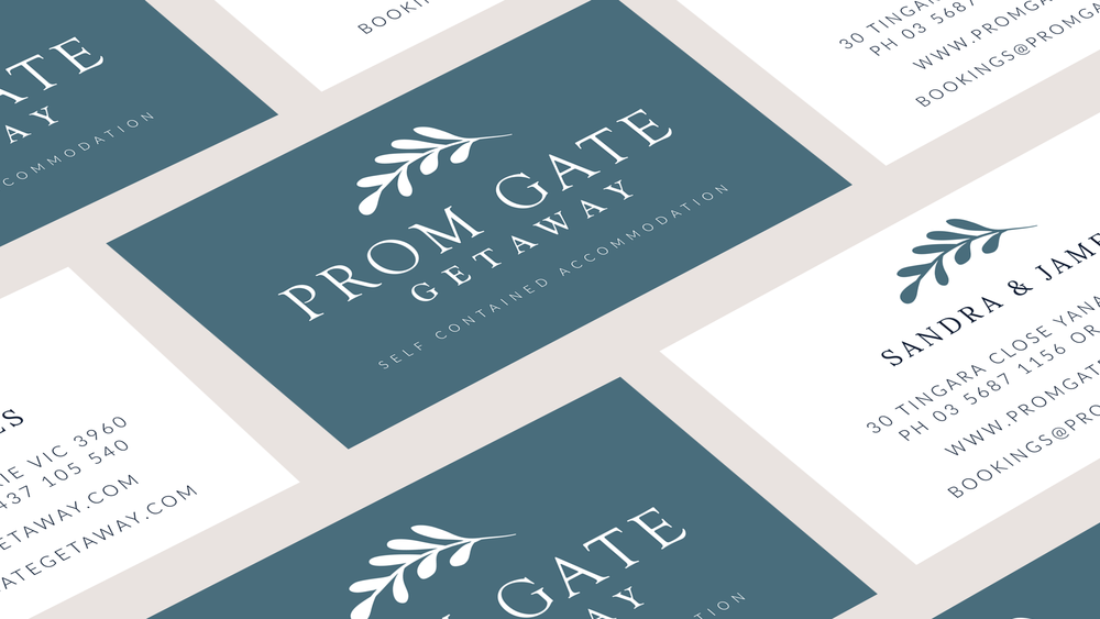
Once the brand board was finalised I created Sandra and Jim a set of business cards. Sandra loved the idea of keeping the business cards simple and clean, so we opted for a solid background on the front with white on the back. It was the perfect addition to the brand identity.


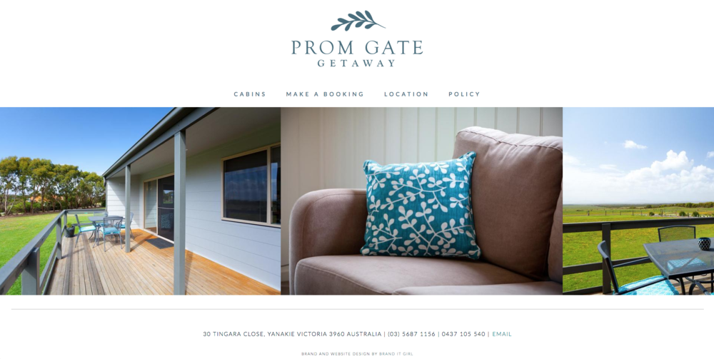
The last piece of the puzzle was to create a brand new website for this new brand. Again, the brief was to create something simple and clean that showcased the natural beauty of this holiday destination. 

Of course, the website is built on Squarespace. It makes it so simple for Sandra and Jim to make changes whenever they need to and it's mobile responsive too. Two things that were very important to these clients.

I am sure you will want to have a look at the site yourself! So head on over and have a browse - and totally book a cabin at this gorgeous place if you are ever in Victoria, Australia!

Sandra and Jim were two of the kindest people I have ever worked for! I can't wait to see what they do with this new brand and I am very much looking forward to heading down to Vic for a visit!


Join the Brand It Society now!

Do you ever feel like the black sheep amongst your friends? Like they don't understand what it is you do when you talk about your online business, or how you work from home, or your life as a blogger.

I'm making it sound overdramatic, but the reality is that ladyboss entrepreneurs and bloggers can feel super lonely. We work alone, we strategies alone and work out all the nitty gritty details of our business - ALONE.

And I am honestly over it.

So I have created a FREE Facebook group to kind of pull me out of isolation and hopefully pull you out too!

Let me introduce to you Brand It Society!

So here's the aim:

  • To create a community of women who are putting their heart and soul into creating brands, business and blogs that they love.
  • To create a community of people that understand each other's struggles and support each other through the ocean of uncertainty when it comes to online business.
  • A platform to share what you are working on, what you have created and what you are super proud of!
  • A place to ask questions, get advice and run ideas by people who can actually give you the feedback you are looking for!

So what do you say? 


JOIN THE FREE BRAND IT SOCIETY FACEBOOK GROUP!


We will be doing a bunch of fun stuff in the group and each day there's a different prompt!

MATCHMAKING MONDAY
INSPIRE TUESDAYS
PROMOTE WEDNEDAYS
TOOLKIT THURSDAYS
SOCIAL SHARE FRIDAYS
WEEKEND WARRIORS

So there is always something you can get involved in OR you are welcome to post questions and thoughts at any time!
 

JOIN THE FREE BRAND IT SOCIETY FACEBOOK GROUP!

I hope to see you there!

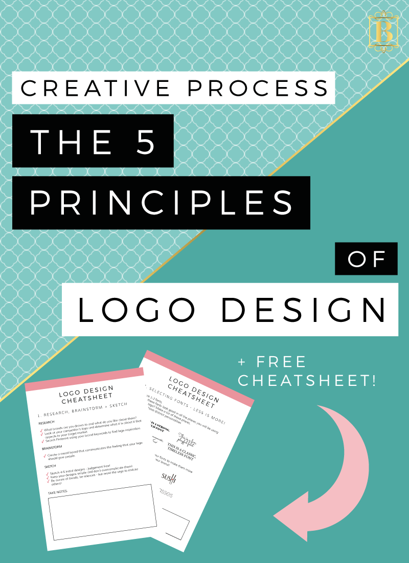
Creative Process: 5 Principles of Logo Design

A lot of my job involves making logos for individuals and companies that reflect their personality, unique value proposition and the brand as a whole. It is important for me to understand the people behind the logo; what they do, what services and products they provide and who they are, as special, one-of-a-kind people.

Since starting out as a freelance designer, I have developed a process that helps me to get into the minds of my clients to determine what they want and need. A designers process is unique to their practice, but I have simplified my process to a point where you can emulate what I do. It's a three step process to creating a logo that looks like this:

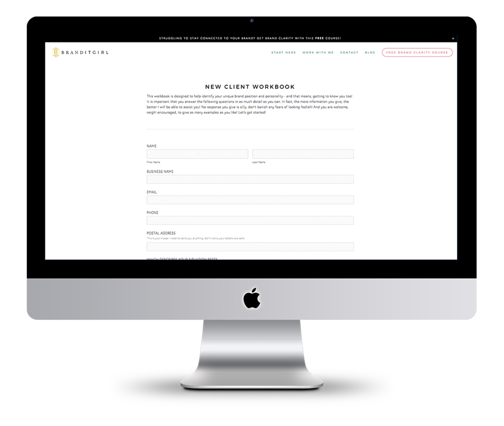
STEP 1 | I get to know my new client by asking them to fill out a New Client Workbook. The workbook has a range of questions: some that are designed to get to know the market this brand will operate in, like "What is your target market, who would you like to be targeting that you aren't already?" and others that help me to understand what the client is looking for, like "Aesthetically what are you drawn to? What colours, patterns, shapes, typefaces?" and "List companies whose branding you both love and loath."

STEP 2 | After reviewing the workbook, I create my own Pinterest board and collect images and example of branding that help to clarify the brand direction I will be proposing to my client. From here I create a moodboard that reflect my ideas for the branding.

STEP 3 | Once I have a good idea of the brand personality and direction I will take the brand in, I create four initial logo designs to present to the client and then from here we narrow down the choices and really start to see the brand identity emerge.

So as you can see here, the cornerstone of a strong brand is a strong logo. Of course, hiring a brand designer will ensure that this cornerstone is set firmly in place, however I know we can't all afford a designer, especially when we are just starting out with our brands! 

The good news is, if you want to DIY your logo, I have the 5 principles you need to keep in mind!


1. RESEARCH, BRAINSTORM + SKETCH! 

The very first principle of logo design is to do your homework. This is why I take the time to ask my new clients a range of questions that help me to understand the product or service, the market and the person behind the brand! Taking this time to research and brainstorm is crucial! But how do you conduct this kind of research and brainstorming?

  • Consider brands that you, as an individual are drawn to - what elements appeal to you? Is it something about the colours, shapes, textures? What feelings go these brands create for you.
  • Check out your biggest competitors - the brands, businesses and blogs that your target market is drawn to. Look at their brand aesthetics and what it is about those brands that really make them stand out. Perhaps even talk to your target market and ask them what elements of their favourite brands attract their attention.
  • Browse Pinterest and find images that give you the same feeling that you hope your brand will - save them all in one place like a secret Pinterest board so you can see all the images together. Find a range of different images - photographs, illustrations, graphics, typography, quotes, textures and patterns.
  • Create a moodboard from these images that captures the feeling of your brand.

Once you have a firm grasp on your brand concept, start to design your logo. I recommend creating 4-6 initial designs and remember: keep it simple and don’t overcomplicate it! This is one point where DIYers often slip up, they will try to create something complex when really something clean, crisp and relevant will be far more sustainable in the long run. I also recommend sketching these design ideas out on paper before you turn digital.

One tip though when designing your logo - don't follow trends. While I encourage you to be relevant, I also don't want you creating something that has a shelf life - and often following trends will ensure a shelf life! Following trends also unfortunately means that you might inadvertently imitate the work of others, and we don't want that!


2. SELECTING FONTS - LESS IS MORE

When you are designing your logo, 99% of the time you will need to select fonts and this can be a stressful part of the whole process! But like I said in the last section, this can be overwhelming because people tend to overcomplicate it!

I recommend picking 1-2 fonts for your logo. Choose more fonts than this can create a really messy look if it isn't done properly - and in my opinion, that kind of complexity is better left to the professional designers. Keeping it simple and selecting only 1 (or max, 2) fonts will make it easier to be conscious of how your text will look across different communication points and at different sizes. We will talk more about sizes soon, but when I say 'communication points', I mean, how will this font work on your website, on your business cards or even on your packaging?  

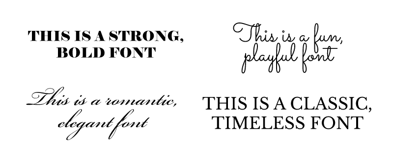
Other considerations to remember when it comes to selecting your fonts is first the character of the font you are choosing. Let’s look at the character of some fonts:

 Elephant | Sacramento | Bickham Script | Libre Baskerville

Some fonts are strong and solid, giving an authoritative feeling of stability and boldness. While others give more of a feeling of fun and playfulness. Considering these font personalities and comparing them against your brand personality is a great way to ensure consistency across this element of your branding.

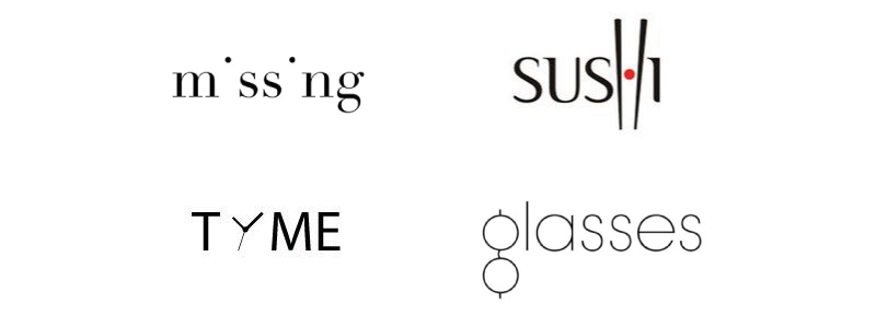
Remember you can always adapt a font too and changing the structure of letters can be super effective in giving your logo font character! So for example, you will notice clever little ways these brands have altered specific letters to make quirky, unique logos!


3. SPACING + COMPOSITION

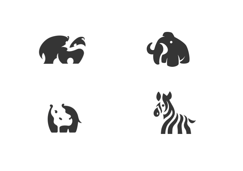
When considering the image that your logo creates you will need to consider the space you are using. Or rather, the space you are not using. One of the key principles in creating a successful logo is to pay attention to the space within and around it.

So by this, I mean the area that the image, icon or text occupy as well as the space that is left blank - we call this negative space. 

Image Source

As you can see from the examples above, the space you don't use can be just as important as the space that you do use. So consider the role of negative space in your logo design.

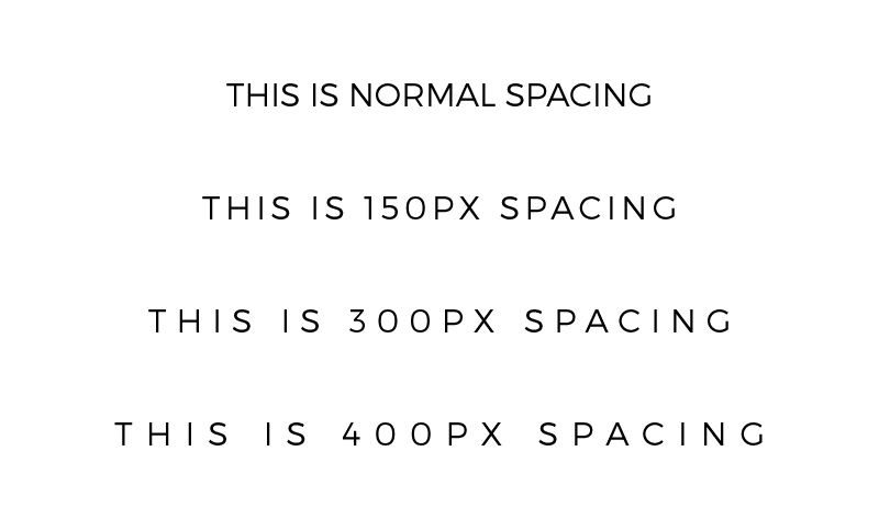
Another situation that spacing plays a role in your design is letter-spacing. Now, I am a huge fan of letter-spacing and all good graphic software will allow you to change the space between letters in your words. Giving the letters some space can drastically change the appearance of a word. Here's an example of how letter-spacing can completely change the feeling of a word using the exact same font:


4. BE MINDFUL OF SIZING + CLARITY

Remember that your logo might be used at different size points and you want to ensure that it is still legible at these different points. So, the issue here is that sometimes when you reduce the size of a logo it becomes difficult to read and distorted. This is particularly the case when you logo has a lot of finer details. 

To combat this issue, make a list of all the places you might use your logo. Here are a few ideas:

  • ONLINE | Social media, email signature, website header, landing pages, registration pages, webinars, avatar images, profile images, newsletter header, image watermark.
  • PRINT | Business cards, letterhead, packaging, tags, signage, clothing/uniform, welcome packs, labels, books, notepads and stationary.

Once you know the range of places you might use your logo, determine the size of these places and test your logos at the different size points to ensure it will work properly.


5. CREATE LOGOS THAT ARE ADAPTABLE
(ALTERNATIVE LOGO VARIATIONS)

One thing that I love to do with my logo designs, is create logos that allow for variations. This means creating a brand identity that is adaptable and versatile, with logo variations that can be used in different places.

Knowing where you might use these variations is the key to creating them successfully, so before you start your logo design, brainstorming all the places you might use a logo and if there are any specific requirements, is a great idea (see the list of possible places you might use your logo above). For example, determine if you need a logo variation that is square for use as your social media profile images, or if you need a logo to be white in order to overlay over images as a watermark. Knowing how you will use variations upfront is key in creating meaningful alternative logos and having this in mind when you start your logo design process will ensure you are creating a cohesive and consistent brand.

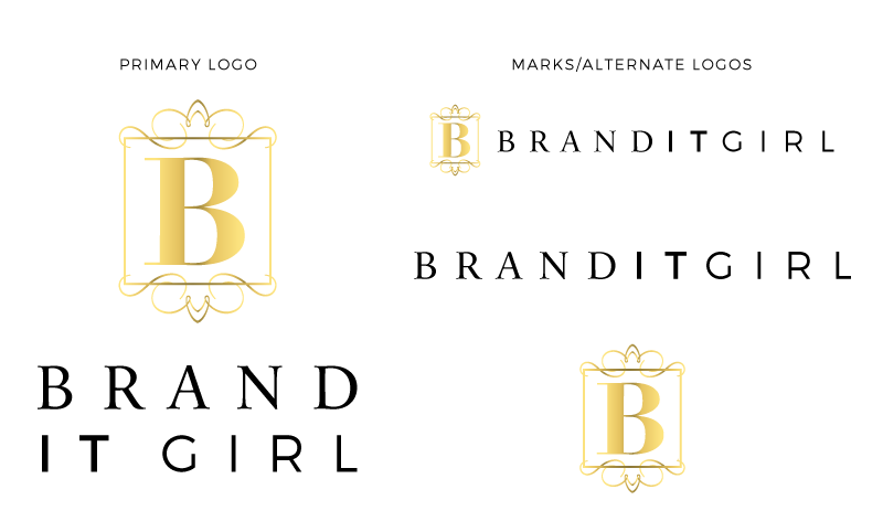
Here's an example of the Brand It Girl logo and variations. As you can see, they all work together as a cohesive brand logo team, but the different variations give me options to use at different communication points.


DOWNLOAD THE LOGO DESIGN CHEATSHEET!

Let's take the guess work out of designing logos with this cheatsheet - re-capping on the 5 principles of logo design + questions that will get you clear on exactly what you need when designing your next logo!

Don't forget to leave a comment (with your link so I can visit you back!) and let me know what you find most challenging about designing logos! Or if you don't design then, tell me what you do and don't like about your current logo!

Adding Google Analytics to Squarespace

As you might know, I switched from Wordpress to Squarespace a while ago now and the move has made me really passionate about sharing how simple, yet dynamic Squarespace is! Quite some time ago, I shared a guide to adding Google Analytics to Wordpress and so today, I will be walking you through the same thing on Squarespace.


STEP 1: FIND YOUR TRACKING CODE

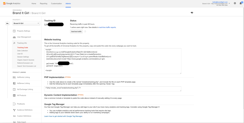
In Google Analytics, you will find a unique tracking code which is essentially the key to successfully tracking your metrics. So before you even open Squarespace, you will want to navigate over to Google Analytics and find this snippet of code. Signing up for this is free, and once you are signed up and inside the dashboard, find the Admin tab at the top. You will see Tracking Info in the middle column and once you click on that, a further menu will open where you will find Tracking Code. Click on this.

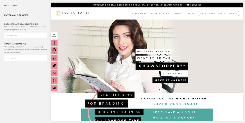
Once you have opened this page, you will see your unique tracking code that will start with UA and is followed by a series of numbers. You can see an example of this page below, but I have blacked out my tracking code, so it should give you a quick visual reference where to find your own code:

Now that you have that tracking code - I recommend copying it to your clipboard (Command + C on your keyboard) so that you can easily paste it in when you need to.


STEP TO: ADD GOOGLE ANALYTICS TO SQUARESPACE

So you have your tracking code copies. It's time to log into your Squarespace site. Once your are in the backend of your site, you will want to click the Settings tab on the left hand side dashboard and then scroll down around half way down the menu. You will see there an Advanced tab. Click on this and select External Services.

See where it says Google Analytics Account Number? Well that is where you paste in that tracking code. Since you copied it with your keyboard, you will just need to paste (Command + V) the code into the field and it's all done!


Note that it will take a day or two before your Google Analytics populate, so don't be alarmed if it flat lines - especially if you are transferring your website from a different platform over to Squarespace! Furthermore, remember that Squarespace does offer it's own metrics and sometimes they can be different to the metrics Google Analytics give you. This is because Google Analytics and Squarespace measure things a little differently to one another and this will impact on your numbers.

But that's all! You've successfully installed Google Analytics on your Squarespace site! 

Is there something you would like to learn when it come to Squarespace? Pop in a comment below and I will schedule a blog post! So tell me, what do you want to learn next? (And don't forget to leave your URL so I can visit you too!)


5 Branding Myths + The Quick Fixes To Get Back on Track!

Ok, so you have fallen into the branding myth trap. Don’t stress! I have some quick and simple brand fixes for businesses, brands and bloggers that need some serious myth busting tactics to get their brands back on track! But what if you don’t even realise you have fallen prey to these common brand misconceptions? It’s ok, don’t beat yourself up - let’s go through them and get those branding mistakes sorted right now!

Also, I know you might prefer to listen to this blog post rather than read it! So I’ve got the audio version for you right here:


MYTH 1: “I have branding: here’s my logo!”

If I had a dollar for every time I heard someone say that they are starting a business, so they’ll need some branding, followed swiftly with “how much would it cost to have a logo made” - I tell you, I’d be one rich lady! You see, this is one of the most common branding misconceptions out there, people genuinely believe branding is simply a logo. And they are equally genuinely surprised when they find out that it is so much more. Let me explain:

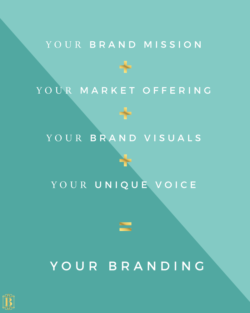
Your logo is a hugely important part of developing your brand but it is just the tip of a much bigger iceberg. To create a successful brand, you need to consider the four foundational pillars:

Each of these elements that make up your brand require equal attention. So, as you can see, your logo is only one piece to the branding puzzle. If you are focusing on just creating a logo, you are missing the bigger picture, and you are likely not building a strong brand!

THE FIX: To avoid falling into the trap of believing that your branding is just a logo, think about a brand you like and connect with. Think about all the elements that make up that brand: it might be the logo, sure, but what about their brand colours, fonts and elements? Their packaging, their store layout, their website, their photography, their social media graphics and what they post there, their e-news communications, their swing tags, their shopping bags, their flyers, their brochures? And you might not realise, is it’s also how they talk to you, what they offer you that is unique, how they make you feel, the language they use and the community they build. All of this comes into a winning brand identity. So the myth buster here is to really think about that brand and consider everything about it that goes above and beyond simply their logo.


MYTH 2: “I’m just a small business, so I don’t really need branding.”

Piffle! Of course you need branding, why would you NOT need branding? It doesn’t matter if you are a solopreneur or a lone blogger - branding is for businesses of all sizes. Every business and blogger should be well branded, and likewise every individual too. So even if you ARE your business, you need branding. And I’ll tell you why:

Your brand is always communicating with your clients, customers and readers and it’s important to identify what your brand is saying. If you fall into the trap of thinking that branding is not for you because you are a small business or a solopreneur, you could be giving your clients mixed signals and confusing them. This can be deadly for a small business as confused brands lose customers.

Stop playing small! You might just be a small business or blogger but you have big ambition! Get into a BIG brand mindset.

THE FIX: The fix for this one is really all about mindset. Stop playing small! You might just be a small business or blogger but you have big ambition! Get into a BIG brand mindset. How do you do this?

  1. Understand that your brand is worth it. Regardless of the size of your business - you are doing this for a reason! Think about all that time and energy you put into your business - don’t you think it deserves every chance of success? I do. And truly believing this means you will see instantly that branding is vital for you and your business!

  2. Get really clear with your brand mission. What are you and your brand setting out to achieve and who are you both here to serve? Knowing exactly what you are doing and who you are serving will help you to stay focused and create an authentic brand!


MYTH 3: “I can change it later, so this will do for now!”

Not only is this a huge myth, it’s also a massive mistake. There are two key reasons that this is a bad idea. Firstly, if you are leaving your branding uncompleted or not in its ideal form, you are giving your customers the wrong message. You are essentially telling them that you don’t care about your brand enough to put the effort in that it deserves. And you might not realise, but this is translating to your customers and readers in a negative way. They start to think “if she doesn’t care about her own business and brand, then she sure as hell won’t care about me either”. Essentially what you are doing here, is making it extremely difficult to trust you!

The second reason is that businesses that often change their branding confuse people. They become used to seeing one image, one theme, one brand and when it drastically changes (and in the case of some indecisive brands, changes often) it is like brand whip-lash for your community. They feel like they don’t know you and stop noticing your communications and before you know it, you are starting over in more ways than just your brand - you will need to rebuild your community too! Don’t get me wrong, rebrands and brand updates are important (not sure what the difference is? Read about it here.) but remember that these take a huge amount of time and energy. Rebrands and brand updates are not really what I am talking about - I am concerned by the brands that settle for a brand identity that is less than perfect purely because they believe they can work on it later. It doesn’t work like that in such a busy marketplace, you have to be on your game from the start!

THE FIX: Don’t leave it a second longer. Yes, the truth is, you can change it later - but this won’t be without consequence! So whatever point you're at with your branding, ask yourself some solid brand clarity questions (I even have a free mini course walking you through this whole process!). Be honest with yourself about if you are leaving elements of your branding until this illusive ‘later’, or if you are in fact happy with your branding as it is right now.


MYTH 4: “I can’t afford a designer. Branding is just too expensive!”

Now this myth, I can understand. When you are just starting out with your brand and throughout those first few years, money can be in short supply. And if you are a blogger, well, the possibility of generating income might take some time! So paying a brand designer to create your brand identity and all the bits and pieces that go into it can be costly and often not an option.

Your brain starts to go into over-drive: you have the logo, of course, the colours, the fonts, the photography, business cards, packaging, website, storefront, signage, social media, graphics and that’s just the branding. You also have to worry about all the other costs associated with starting your brand. But here’s the thing. It doesn’t have to cost an arm and a leg to create a brand you connect with and that communicates effectively with your target market.

THE FIX: A popular solution to the issue of not being able to hire a designer is absolutely to DIY your brand! And this isn’t as scary as it might sound. You don’t need fancy software, Canva is a fantastic tool for creating graphics, including logos and Squarespace makes it super simple to create an effective and stunning website without needing all that technical coding skill that scares so many new business and bloggers away from creating their website!

Related: Getting Started with Squarespace

The main things to remember when creating your brand identity DIY is:

  • Keep it super simple. No matter what your skill level, keeping your branding simple is by far a better decision! So many DIYers get caught up in creating a complicated brand identity and it just confuses people, looks messy or fails to stay sustainable over time! Keeping it simple will create a clean, fuss-free brand identity that will adapt and grow with your brand over time.
  • You are not locked in. While I am telling you not to change your brand too often, I do want to emphasis that when you create a simple brand, it does have the potential to evolve over time and this means you are not locked in. Sure, the overall brand identity might remain the same, but as you and your brand grow and trends shift, a simple brand identity can be updated easily without losing face with your community.
  • Be specific and consistent. I recommend selecting 4-5 colours and 2-3 fonts for your brand identity. Be very specific with what you are choosing, type them up and print them out. Using these colours and fonts only when creating graphics for your brand will ensure you stay consistent and here’s the secret to branding: consistency. Consistency is the difference between a good brand and a great brand that they won’t forget!
Consistency is the difference between a good brand and a great brand that they won’t forget!

MYTH 5: “I let my work do the selling for me, if it’s good, they’ll buy. So branding doesn’t matter.”

I can imagine you put your whole heart into your work. It’s your pride and joy, after all, your offering to the world and it makes you genuinely happy. Let me paint the picture for you: You had that crazy, burning idea - a way to create a better life for yourself, for your family. Freedom, flexibility. Something different. You have a skill, a product, something you can sell and something you can say that will impact others. So you take the plunge, you work evenings and weekends on this idea. You are exhausted after a long week but you know if you can just get this business and blog up and running, everything will change. You won’t be exhausted anymore.

You quickly realise that you need to invest more than just your time. You are happy to do this, remember, this business and blog is a game changer for you. You produce your product, you list your services and you spend hours slaving over your blog posts to make sure that it’s the exact info your people need. You have invested so much money and time and more than anything, you have invested a piece of yourself.

Here’s the thing, without a brand identity that connects with your people, the product, service or blog you put your heart into, it will not sell. And here’s why: Branding connects your brand with your ideal customers and readers. It establishes relationships and builds trust. Without it, your brand is essentially a stranger to the people you so desperately want to serve!

THE FIX: Like Myth 2, this fix is all about mindset. Realising that for all the effort you put into creating your product, services or blog content; equal effort should be invested into your branding. Why? Because you have already invested so much time, money and soul into what you are selling, so your brand really deserves a little attention too!

Think about brands and bloggers you really love. What is it about them that you connect with? And more importantly, would you feel so connected with them if they didn’t have the branding that they do?

My guess is that their branding plays a huge role in how you feel about them and there is one very good reason for this: good branding makes us feel more like ourselves, more authentic and more powerful than you would without it. Essentially, when we look at a brand, we are measure the degree to which we feel it reflects our ideal self. The YOU that you want to be. If a brand can’t establish that connection with their customers, then it’s likely they won’t even get to the point of browsing your products and services, and reading your blog.


If you felt that tingle of familiarity while you were reading these top 5 branding myths, then I encourage you to take action! I don’t want anything at all to hold you and your brand back! So I have created the Branding Mythbuster Workbook just for you. It is full of questions, checklists and cheat sheets to get you and your brand on the right track!

HOW TO: Create a FAQ Accordion in Squarespace

Does your contact page have a list of frequently asked questions (FAQs)? If not, it should. FAQ lists should be a staple on every contact page and it can save you a heap of time.

FAQs are questions that your customers and blog readers often ask you. They might ask you on blog posts, via emails or on social media. Their questions could be on a range of topics from product and service specific questions to questions about how to collaborate with you. To anticipate their needs, you can create a list of the questions that they have either asked or you think that they might ask and answer them for your customers and readers so that they don't have to ask you individually.

FAQS WILL SAVE YOU TIME

Having a FAQ list will save you all that time that it would have taken to type up individual responses for customers and reader that ask them. Having them in one central place means you wont get those questions via email as often and when you do, you can quickly respond by copy and pasting your pre-written answer along with a link to your complete FAQ list.

FAQS BUILD CONFIDENCE

Outlining your answers to potential questions will build confidence for your customers and audience. There are a few reasons for this: firstly, taking the time to outline your answers to FAQs show your customers that you value their piece of mind; FAQs also establish a standard response, so their are no surprises for your potential customers and readers; and lastly, FAQs put their minds at ease, by answering questions your audience might not even know they have yet, you are making them feel confident that you are across all the things that could be a concern to them!

FAQS SUPPORT BRAND CONSISTENCY

Another great advantage of having a FAQ list, is that it actually supports brand consistency. By taking the time to answer these questions in a thoughtful and complete way, you are creating consistent standards for your business and blog. You are essentially saying the same thing, responding in the same way and giving people the same answers to their questions and it makes your brand consistently clear and stable.


Adding a FAQ list to your Squarespace page is easy and there are a variety of ways to do it, but one of my favourite ways is to create an accordion FAQ list. That looks like this:

Q1. THIS IS YOUR FIRST QUESTION.

Place your answer to the question here.

Q2. THIS IS YOUR SECOND QUESTION.

Place your answer to the question here.

Q3. THIS IS YOUR THIRD QUESTION.

Place your answer to the question here.

To add your own accordion FAQ list to your Squarespace site, follow the instructions below.


STEP 1: THE CODE

Put this code in a markdown block on your Squarespace site. So, this should be the page on which you would like to display your FAQ list. You can change the question and answer text accordingly and add as many questions as you like by simply including two hashtags before the question.

## Q1. THIS IS YOUR FIRST QUESTION.

Place your answer to the question here. 

## Q2. THIS IS YOUR SECOND QUESTION.

Place your answer to the question here. 

## Q3. THIS IS YOUR THIRD QUESTION.

Place your answer to the question here. 

STEP 2: JAVASCRIPT

Copy and paste the following code into the header code injection area of your page and click save. If your page is within an index, paste the code into the header code injection area of the Index, not the page.

<script type="text/javascript" src="//ajax.googleapis.com/ajax/libs/jquery/1/jquery.min.js"></script>
<script>
$(document).ready(function(){
$('.markdown-block .sqs-block-content h2').addClass('ui-closed').css('cursor','pointer');
$(".markdown-block .sqs-block-content h2").nextUntil("h2").slideToggle();
$(".markdown-block .sqs-block-content h2").click(function() {

$(this).nextUntil("h2").slideToggle();
$(this).toggleClass('ui-closed ui-open');
});
});
</script>

STEP 3: ADD THE CSS

Once your code is installed in a markdown block on the specific page you want to show your FAQ accordion and you have included the Javascript to make it function, you will need to style it. To make it look like the example you will need the following CSS code and insert it into your Custom CSS field. You will find this in Design > Custom CSS If you have experience with CSS you can edit this code to change the way your list looks!

.markdown-block p {
margin-left:1.5em;
}
.markdown-block .ui-closed:before {
font-family:monospace;
content:"+ ";
}

.markdown-block .ui-open:before {
font-family:monospace;
content:"- ";
}

Spare Change? How I would invest in my business!

When you are just starting out with your business, it's super hard to know what you should spend your money on and when. So I have broken down what I would spend my money on if I were you!

IF I HAD $5.00

Custom Email Address | Google Work Apps
The very first thing (ok, second, buying your domain name is first) I would do if I had $5.00 is purchase my custom email address. This means you can have a professional looking email address. For example, mine is [email protected]. The best part about purchasing your custom email address through Google Work Apps is that when you log into your email it is essentially the Gmail interface, so it's super easy to use! If you are not sure how to set up your custom email you can find a full tutorial here. Note: Before you do this though, you probably want to get the domain name first! See the 'If I had $20.00' section!

Pinterest Scheduling | BoardBooster 
BoardBooster is perhaps one of the best, easiest and most cost effective investments I have made in my business. It is an incredible tool that is essentially a Pinterest scheduling and maintenance app that means you need to spend very little time making your Pinterest account successful. My Pinterest has grown exponentially since I started using BoardBooster and you can read all about the things I love about this tool here!

IF I HAD $20.00

Domain Name | Go Daddy
Before you do anything else, do this! Get your own website domain name. This is your www.yourname.com address and securing your ideal name is kinda a big deal. Remember a name can only be sold once, so if you let yours sit there for too long, someone else will eventually snap it up! So, if you have a brand or a business name and you have $20 (actually, it can be much cheaper than that), then my number 1 suggestion is buy your domain name. My favourite provider is Go Daddy. Intuitive to use, great support and all round reliable people! Not sure what you are doing? That's ok, read this tutorial!

Business Cards | Moo
Another great way to invest $20.00 is to get some business cards printed. Moo is a great online service that does this relatively cheaply, and if you want to invest a little more they have foiling and letterpress options. I recommend only taking this step once you have set up your domain name and custom email address. Remember to proof read everything before you hit the order button and if you are not confident designing your card on your own, Moo offer a great range of templates to choose from.

IF I HAD $30.00

Graphics | Adobe Illustrator
This is perhaps a little advanced for people just starting out, but Adobe Illustrator is absolutely my graphic tool of choice. I use it every single day to create the graphics for my business, blog and for my clients. It can be tricky to work out to start with, but there are so many tutorials out there and once you get the hang of it, it's simple!

Fonts + Graphics | Creative Market
I would also recommend investing in some beautiful custom fonts and elements from the Creative Market. As a designer, this is my number one place to go to for fonts, graphics, vectors and elements. Regardless of what I am making, I will always stop by the Creative Market to see if there is anything that tickles my fancy! For instance this font bundle!

IF I HAD $40.00

Mailing List | ConvertKit
My eNews provider of choice is ConvertKit. I recently switched over from Mailchimp and really love the automation feature and the way tags can be used to target particular subscribers. It's a great tool to use, good support and intuitive interface and reasonably priced! I talk about my switch to ConvertKit in this recent post.

Landing Pages | LeadPages
LeadPages is the place to go for beautiful and complex landing pages. Although people often argue that you can create landing pages without needing LeadPages (e.g. Using Squarespace Cover Pages instead) - and I do agree, mind you! - LeadPages certainly makes it easier! You can have a beautiful, professional landing page up in minutes!

IF I HAD $100-300

Video Software | ScreenFlow
I love making vlogs, video tutorials and of course video lessons for my upcoming eCourse and so it was a god-sent when I discovered ScreenFlow. With ScreenFlow you can create videos by filming either yourself or your desktop - so this is how people do those slideshow-looking videos! I talk about how I use ScreenFlow in this recent post. I was using Camtasia, which I still think is great, but I love ScreenFlow more!

Microphone | Blue Yeti Microphone
I also talk about the Blue Yeti Microphone in that post, and let me tell you - it is the best thing since sliced bread! Once you get those settings right, this mic is AMAZING. The clarity is next level and the mic is adorable!

Website | Squarespace
And lastly, my favourite investment to date is absolutely my Squarespace website. I was with Wordpress for a very long time, and I still love Wordpress, I really do. But Squarespace has changed my business and so the switch over from Wordpress to Squarespace has been one solid investment! It is just so simple to use yet offers advanced coding options - I just swoon! You can read all about starting out with Squarespace in this recent post. I definitely recommend Squarespace to all businesses, check out their different packages and levels - I am sure you will find something to suit!


So, what would you spend your pocket money on? If you have any questions at all about any of these tools and/or services, please don't hesitate to leave a comment below. Have a tool you love and think should be added to the list? Pop that in the comments too!

(Note: Some of these links are affiliate links, which means I get a small financial kickback if you purchase them too. However I only promote products I personally use and believe it!)

2 Ways to Add 'Click To Tweet' Quotes to your Squarespace Blog Posts!

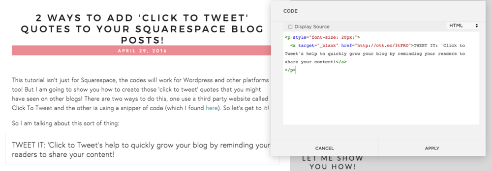
This tutorial isn't just for Squarespace, the codes will work for Wordpress and other platforms too! But I am going to show you how to create those 'click to tweet' quotes that you might have seen on other blogs! There are two ways to do this, one use a third party website called Click To Tweet and the other is using a snipper of code (which I found here). So let's get to it!

So I am talking about this sort of thing:

There are a few reasons that the Click to Tweet quotes are so effective!

  1. Firstly, as I mentioned in the above Tweetable quote, they remind your readers to take action and share your content. Often readers will love your blog posts but will absent-mindedly click away without sharing it. This is a little virtual nudge!
  2. By making a quote stand out and highlighting it as something shareable, you are also highlighting the main take aways from your content to ensure that your readers know what is really important on a given subject.
  3. It breaks up the content of a blog post. I am a serial long-form blog post writer. I don't write long posts instead of short posts due to any specific market research I have done, I just have a heap to say and so I say it all! Sometime all the text can get boring, and a reader might glaze over it. Well, Click to Tweets stop the eye and breakup the content by presenting something new and different. 

METHOD 1:
USING THE CLICK TO TWEET WEBSITE

For some, this will be considered the easy method. It is so very simple if you know exactly where to look! You will find the Click to Tweet website here and you just need to sign in with your email address.

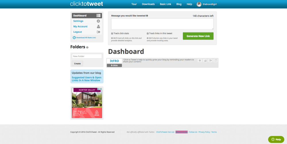
Your dashboard will look like this and to generate a Click to Tweet quote, you simply enter the quote into the large text field and click Generate New Link. I recommend checking the Track Click Stats and Track Links to this Tweet, it is a great way to keep track of how these quotes are performing!

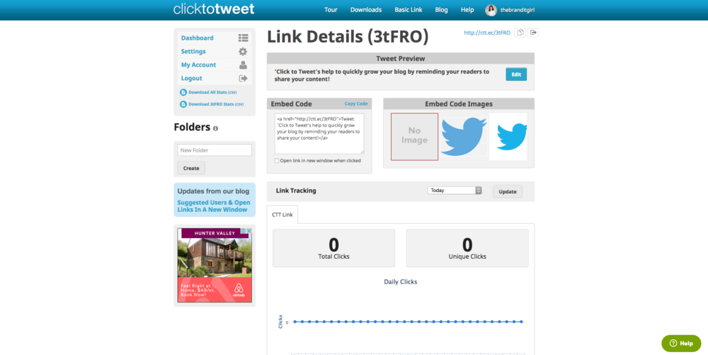
You'll be taken to the Link Details back and all you need to do is copy the Embed Code that they offer you. Head to your Squarespace page and find the blog post you would like to add the quote to. You will need to go into the blog post editor and hover over the location of the new Click to Tweet quote. Choose the code content block.

Paste the embed code into the code block. You will notice I added a little extra code. This is makes the writing appear slightly bigger than the rest of the text so that it stands out. You can use CSS here to change the way it looks!

And that's it!


METHOD 2: USING A CODE SNIPPET

Method two is arguably more difficult but if you have the code saved somewhere, it is a matter of copy and pasting it each time you need to add a Click to Tweet and simply change the details.

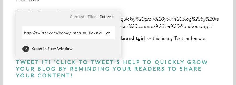
Use the normal link button on your blog post editor and enter this snippet of code:

http://twitter.com/home/?status=

Directly after the url add in your quote and replace each of the spaces between your letters with %20%

http://twitter.com/home/?status=Click%20to%20Tweets%20help%20to%20quickly%20grow%20your%20blog%20by%20reminding%20your%20readers%20to%20share%20your%20content!%20via%20@thebranditgirl

You will notice at the end I also include via @thebranditgirl <- this is my Twitter handle.

If you enter all this correctly it will look like this:

TWEET IT! 'Click to Tweet's help to quickly grow your blog by reminding your readers to share your content!

I also selected heading 3 to change the appearance of this text. It will open the tweet in a new page and allows users to add and remove any thing they like!


FORMATTING YOUR CLICK TO TWEET

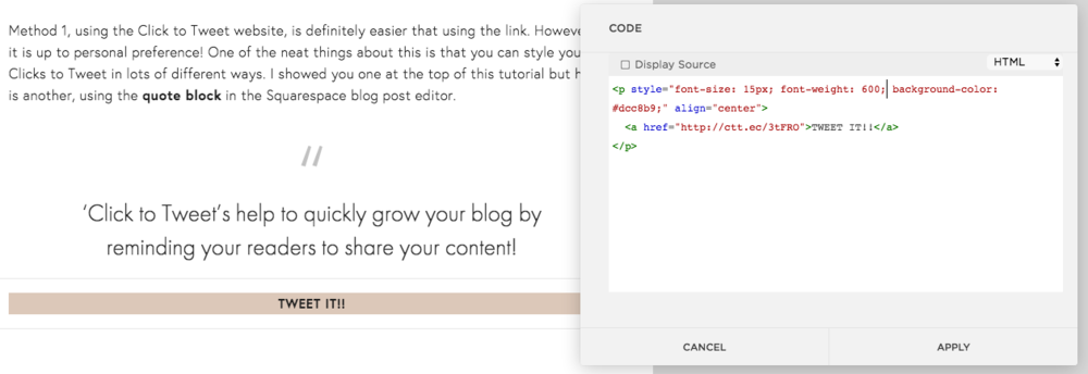
Method 1, using the Click to Tweet website, is definitely easier that using the link. However it is up to personal preference! One of the neat things about this is that you can style your Clicks to Tweet in lots of different ways. I showed you one at the top of this tutorial but here is another, using the quote block in the Squarespace blog post editor.

‘Click to Tweet’s help to quickly grow your blog by reminding your readers to share your content!

To make your Click to Tweet quote look like this you will need to first enter your quote into a quote block.

Then, directly under the quote block, add a code block and enter your link generated on the Click to Tweet website from method 1. You could also do this with a normal link block, using method 2's code snippet.

You will notice the 'TWEET IT!!" is shown in a bar format and you might also notice that there is extra code in that code block. This is the CSS code below that I used to create that effect:

<p style="font-size: 15px; font-weight: 600; background-color: #dcc8b9;" align="center">
       <a href="http://ctt.ec/3tFRO">TWEET IT!!</a>
</p>

I will walk you through this:

font-size: 15px - This changes the size of your text. You can change the number up or down how you please. The lower the number, the smaller the font and vise versa, the higher the number the larger the font.

font-weight: 600 - This changes the thickness of the letters and likewise you can adjust it.

background-color: #dcc8b9 - This is what makes the background behind the words TWEET IT!! a different color. You can change the colour code to anything you like and match your branding!

align="center" - this aligns the whole thing in the centre of your content area.

This is just one great way you can format your Click to Tweet quotes, the possibilities are endless! Play around and choose your own style that will match your brand and personality!


How to Get Started and Level Up Instantly with Pinterest (+ Free Pinterest Planning Worksheet)

Getting started on any new platform is confusing. The way it looks, where all the options and settings are located and how to edit it - it's all big questions. But one of the biggest questions I see time and time again is how to make the most of a platform when you first join it.

Now, the tips and tricks I will be sharing today are not just for people starting out, but also for Pinterest users that want to level up and really start using Pinterest to make an impact on their business! But, if you are just starting out, this guide will help you Pinterest FAST and you will get the most out of it really quickly! So here are a few tips on how to get started and how to make the most of Pinterest right away:


JOIN AS OR CONVERT TO A BUSINESS ACCOUNT

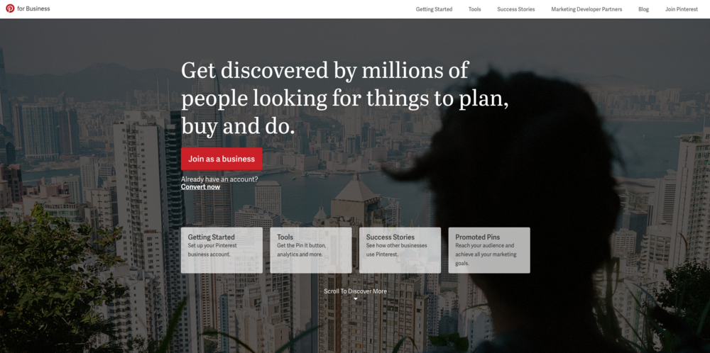
The first thing you should do is join Pinterest as a business using this link. This will allow you to either join as a business (using the red button) or convert your current account (using the 'convert now' link located under the red button). Creating a business account or converting your account will instantly give your blog authority but more importantly, you will also be able to access the Analytics that Pinterest provides its business account holders. It doesn't cost you anything, and makes a huge difference when you are able to see what is being pinned. I check these analytics once a month when I am planning my blog content for the month ahead, and it can provide some insights into what my readers want to see!


VERIFY YOUR WEBSITE

Confirming that you own your website adds your profile picture to any Pin that came from your site. It also has an impact on your analytics as you will be able to see what people are Pinning from your website. 

How to confirm your Squarespace site:

Squarepace and Pinterest recently partnered to make connecting your accounts easy peasy.

The first thing you'll need to do on your Squarespace site is approve the connection. Do this by navigating to Settings > Connected Accounts > Pinterest Account > Connect. This will then ask you to authorize the connection between Pinterest and Squarespace. Click Allow.

How to confirm using a meta tag (using Wordpress):

If you are not using Squarespace you can opt to add a meta tag to complete the connection. So this is perfect if you are using Wordpress. To do this you need to navigate to your name at the top of Pinterest and then click on the gear menu > Account Settings. In the Website field, click Confirm Website and it will generate a meta tag for you. Copy this snippet of code.

Navigate to your website and add this snippet of code to the <head> section of your index.html file. This section is located before the <body> section. In Wordpress, to do this navigate to Theme Settings > Header Scripts and paste the snippet there.

For full confirmation instructions, Pinterest have created this great guide for you to access here.

After you have authorized the connection in your Squarespace or added the meta tag to your header, you can navigate back to Pinterest, click on your name > the gear menu > Account Settings and click Finish on the website confirm field. Pinterest will automatically check the meta tag is working and confirm your site. If it doesn't work, try refreshing your browser and confirming again. If it is all authorized and installed properly, it will confirm your site!

STEAMLINE YOUR BOARDS

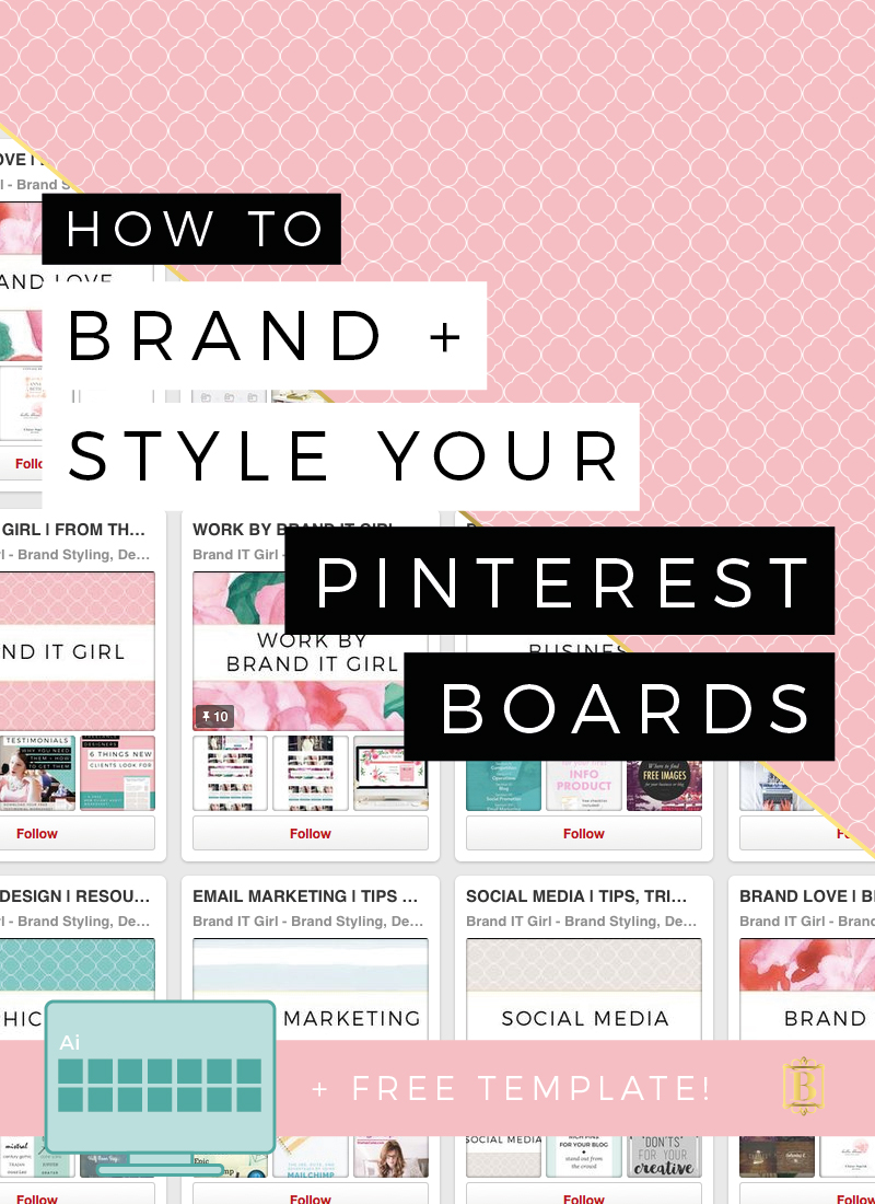
The way your boards look are actually really important - so important infact, I have written a whole tutorial on branding and styling your Pinterest where I show you a bunch of examples of well branded Pinterest boards.

It is so very important to maintain your branding across your social media platforms and your Pinterest boards are no exception. Here are a few quick tips for streamlining your boards:

1. Only display boards that are relevant to your business and blog niche.

This means that if you are a knitting blogger, ensure all your boards are related to knitting, yarn, crafting etc and that you don't start pinning about gardening and cooking for instance. Keep your visible boards relevant to your target market and this will build you up to be an authority in the field, somewhere people can come if they want to know about your specific niche.

Don't be afraid to delete boards that don't fit with your focus. You can also make boards that are off topic secret meaning that they are visible only to you. Use the table in the workbook to outline which boards you will have!

2. Pay attention to what you re-pin.

I also encourage you to re-pin images that fit with your overall brand aesthetic. Keeping everything on a similar colour palette or mood creates brand consistency and keeps people's attention. They don't have to work overtime trying to figure you out - it's simple and easy to consume.

3. Brand your Pinterest board cover images.

This is my favourite part! Making sure all of your board cover images are branded is such a neat trick and something most people forget about! It doesn't take long and creating custom board covers is actually really fun. I have created a full tutorial in that brand and style your Pinterest post, and PLUS you can download the Pinterest board cover template for free!

4. Delete under-performing pins.

This is something I hesitated with when I first started getting serious about Pinterest. I was afraid to delete anything and now I am not sure why I ever had that fear! Deleting pins with low or no re-pins might feel weird, especially if you like the pin, but it tells Pinterest that you are serious about maintaining quality boards. 


MAKE IT EASY FOR YOUR READERS TO PIN FROM YOUR SITE!

There are a few ways that you can make it easy for your readers to pin right from your site.

1. Install Pin-it Buttons

Firstly, displaying Pin It Buttons is a great way of encouraging your readers to pin your images to their Pinterest boards. Sometime people just need a little reminder that they have this option, so install pin-it buttons or turning on social sharing if you are using Squarespace is a great way to nudge them to do so!

Using Squarespace: To add your pin-it buttons navigate to Settings > Marketing > Pin It Buttons and select Enable for Blogs.

After selecting an option, additional style options will appear. You can customize these options using the drop-down menus and select the size, shape and colour of the pin-it button.

Using Wordpress: If you are a WP user, I have written a full guide on how to install custom pin-it buttons here. PLUS, there are a bunch of free pin-it buttons you can download and use on your own Wordpress site.

2. Create Pin Worthy Images

Here are a few things to remember when creating your blog images with the hope and intention that your readers will pin them to their Pinterest boards. Firstly, vertical images have a much higher chance of getting re-pinned than landscape images. The reason being is that they sit nicer on the Pinterest feed and the way that Pinterest boards look are actually really important to users. 

Using high quality, well designed images are also important. Colourful photos are often more successful than darker images and images without faces are preferred. Weird right? But statistics also show that images with backgrounds rather than white space are more likely to get re-pinned.

One of my biggest tips is to make all your blog images follow a consistent theme. This tip wont only help your Pinterest, but it will also help your blog as a whole. For instance, all of my blog images follow a set theme:

ByRegina.com also does a great job with this. Her images are all unique in their own, yet they follow a clear and cohesive theme:


NAME YOUR PHOTOS TO BE INTEREST FRIENDLY

Here is a fun fact, when you name your images, this is the copy that will appear as your pin description when someone pins an image to their Pinterest from your website or blog. So this means that what you name your images actually really matters! Most people wont edit that text, they are all about doing things quickly, so make sure your image names are full of keywords, describe the pin and the topic or article it leads to and make it easy for your pins to be successful without relying on your readers to come up with pin descriptions.

The keywords are really important here because this will be one of the main factors that will impact on if your pin will turn up in a search that a Pinterest user does. So be specific in your image names and make sure they are interest friendly!


MAKE THE MOST OF YOUR PROFILE INFORMATION

Remember that Pinterest is actually a search engine more than it is a social media platform. But on this search engine, your profile matters! Add information that are full of your target market keywords and see the difference it makes to your stats!

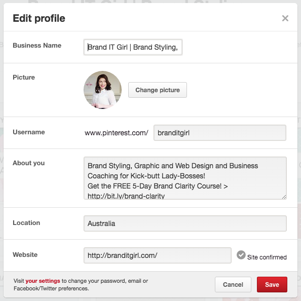
Access the Edit Profile button located next to the gear icon inside your Pinterest page. What you put here is so very important!

Business Name: You will be able to input a business name rather than just your name because you have a business account (remember this was the first part of this tutorial!)

Picture: 165 x 165 px is the best dimensions for your profile picture. I encourage to use a branded image of yourself looking smart and approachable!

Username: Make this relevant to your brand - using your brand name is recommended.

About You: Use this area to load it up with keywords that will attract your niche. I also like to pop a link in there to my latest opt-in offer and freebie. So as you can see here, I link to my free 5-day brand clarity course right there in the 'about you' field.

Location: This is a great thing to enter too as it will come up on your pins.

Website: This is where you can confirm your site (step 2 of this tutorial). You should have your website URL entered and the Site Confirmed should have a tick next to it.


AUTOMATE YOUR PINTEREST EXPERIENCE

Lastly, I also want to share with you my Pinterest secret weapon (that's not so secret anymore, because it's so damn useful, we are all shouting it from the roof tops!)

It's called BoardBooster and it is a miracle!

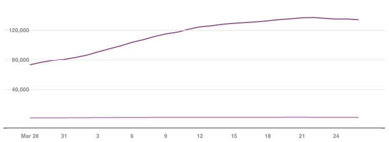
You can read my whole blog post on it here, but essentially, BoardBooster gives you the ability to loop pins, schedule pins and clean your boards to ensure maximum success. I have to tell you, since using BoardBooster my engagement has just been going up and up! Look at this graph, showing my engagement over the last 30 days alone!

Want to use this amazing tool to
grow your own Pinterest account?

And make sure you check out my post all about this for more details on how to use BoardBooster and all the great functions it offers!


So now I have given you all the tips and tricks to start out and level up with Pinterest, I would also like to give you a super handy Pinterest checklist and guide! It's short and sweet, only 3 pages, so it wont take up too much of your time but walks you through getting your Pinterest on track for success!

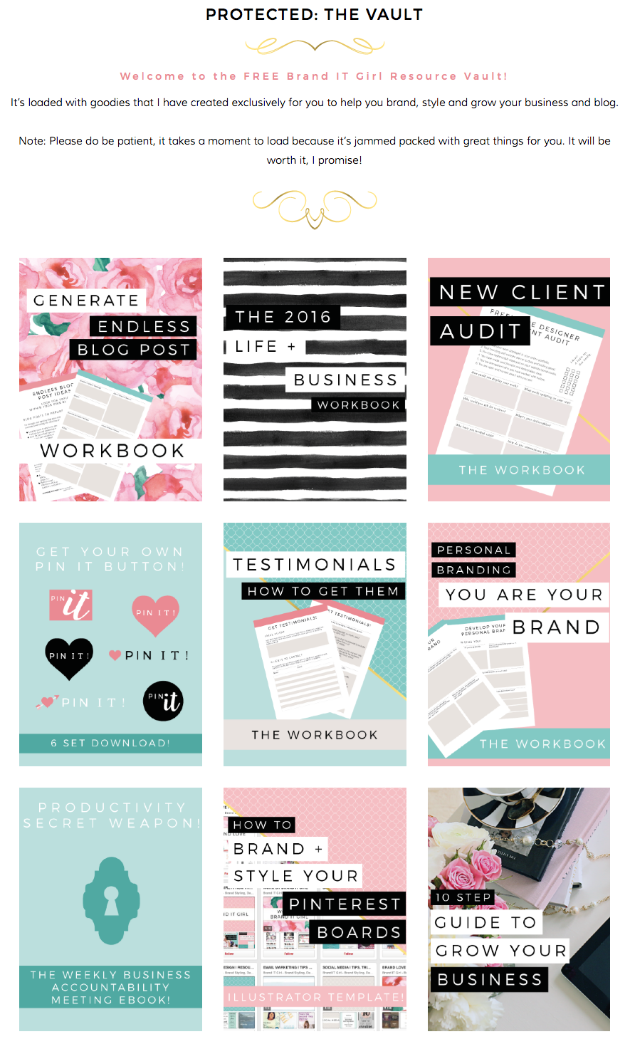
GET ACCESS TO THE VAULT AND YOU WILL FIND THE GET STARTED ON PINTEREST CHECKLIST + WORKBOOK THERE! PLUS LOTS MORE GOODIES TO MAKE OVER YOUR PINTEREST!


My Unique Custom Client Project Process (+ Why You'll Love It!)

My absolute favourite part of my job is setting up the process for my custom clients. I offer a full branding and design package that will have you walking away with a beautiful brand logo, business card designs and brand style guide, PLUS a mobile responsive website!

One of the biggest things people say to me is that they just don't know where to start with their brand and that they don't know how to connect with their brand. Sometimes I even hear that they feel like their brand is scattered, disorganised and doesn't make sense

These are really common things to feel when you start considering your brand and so I have developed a process that not only gets to the bottom of these issues and solves them, but does so in a way that is really fun, intuitive and holistic!

So let's step through my process. I will walk you through each of the elements of my custom client process and explain why you will love it. How do I know you will love it? Well, everyone flipping loves this process, and I know you will too.

Ok, drum roll...


ON BOARDING + NEW CLIENT WORKBOOK

When a new client approaches me, I ask them to tell me a little about themselves and their potential or existing brand first through email. If I think we are a good match, I will send them a work brief and quote that outlines the project deliverables, how it will work and proposed timelines, and include also a breakdown of the cost. 

I like to be upfront about the cost so that there are no surprises for my new client down the track. The final price will be the quoted price. If the client feels comfortable with the work brief I will send through a Paypal invoice or they are welcome to send through payment via Bank Transfer. 

I have a payment upfront policy. There are a variety of reasons for this and you can read all about them here! However, if people are struggling to make this full payment, and I have a work queue, I will invoice for 50% holding deposit and the remaining 50% as we start the project.

From here, the client is given a start date and the link to their new client workbook. Some clients will also require some basic coaching and guidance at this point. I encourage clients to start their workbooks early and provide as much detail as possible.

The questions I ask will give me an insight into:

  • who the client is and what their vision is for their brand; 
  • clients aesthetic tastes;
  • we conduct a mini customer profile and competitor analysis;
  • and ask for a range of examples to give me a sense of what the client is looking for.

STARTING THE PROJECT AND THE CLIENT PROJECT PORTAL

When the time comes to start the new project, I send the client a project commencement email. I use Canned Responses offered by Google Work Apps (the provider I use for my custom domain email address). I let them know that it's time to launch their project and provide them with the login details for their very own project portal!

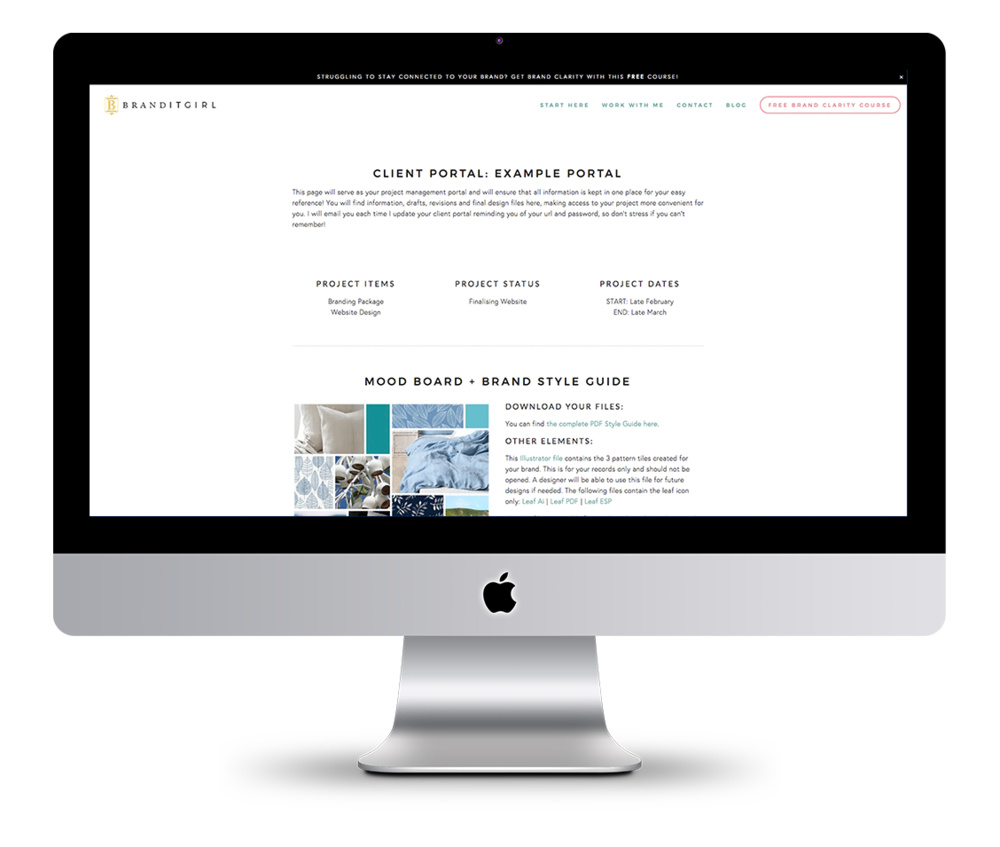
The client project portal is a super cool thing I started doing around a year ago (back then I was on Wordpress and used a plugin called Project Panorama which was very pretty but didn't provide me with the options I wanted). I now use a separate, passworded page in my Squarespace site to house each of the client portals. I provide the client with the URL and password and inside they will find information such as:

  • the project description and start and finish dates
  • project deliverables and the status of the project
  • project timeline and due dates
  • initial designs previews as the project progresses
  • final designs (in a range of sizes/types) for download
  • tutorials and step-by-step guides
  • any additional information and logins

The client project portal is a hugely important part of my custom work process. It allows everything to be kept in one place and means that the client is rummaging through their emails trying to find files and information they might need!


DESIGNING THE BRAND

Once we get started, things move along quickly. I look over the new client's workbook and follow up with them if I need to clarify anything. 

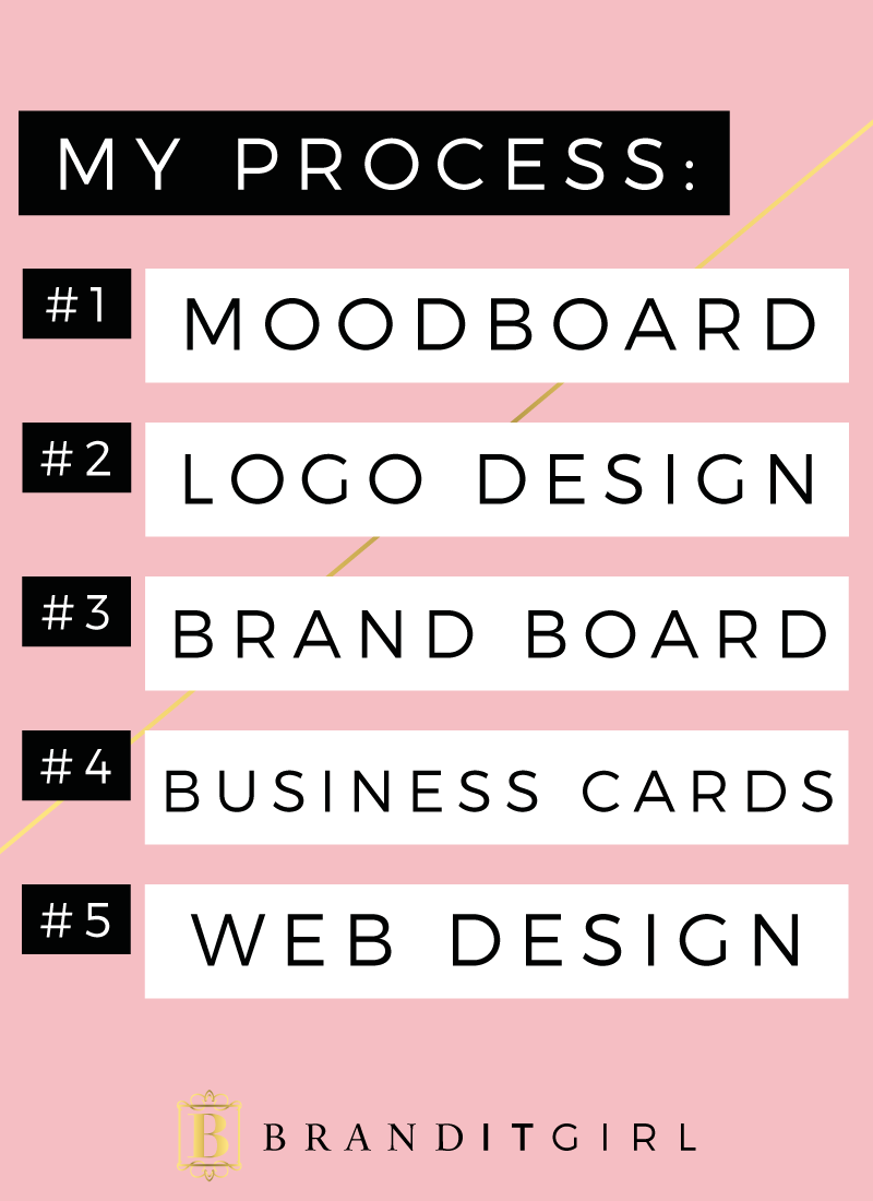
  1. MOODBOARD: I always start with establishing keywords and from here create a moodboard that is designed to capture the feeling, the essence of the brand.
  2. LOGO DESIGN: We then move onto the logo design. The client will be provided with a variety of initial designs, each taking the brand in a unique direction. The client will be encouraged to select their favourite and provide feedback on any changes. From here, the client will be given two rounds of revisions before the final design is created.
  3. BRAND BOARD DESIGN: Once the logo is finalised we will then begin work on the brand board which includes secondary logo variations, fonts, colours and elements.
  4. BUSINESS CARDS: Before we start on the website, the business cards are designed. The client is given two different designs and one round of revisions on their favourite design to make sure it's perfect!
  5. WEB DESIGN: Once the branding is all done, we create your Squarespace website! You will be able to browse the Squarespace tutorials and select one that you feel most attracted too. Alternatively, I will select the template for you and we will get started. I perform advanced editing and coding on these templates to make sure that your website is absolutely perfect and I load all your website copy, images and brand elements in for you. 
This whole process takes around 3 weeks. So within the month, clients have a full and complete brand and website that they can start using instantly!


TUTORIALS + STEP-BY-STEP GUIDES

One of the key things I offer my custom clients is tutorials and step-by-step guides for printing and on how to use and understand their new website. I believe in giving my clients the power to take control and understand their brand and website and how it all works. 

It's so easy to set people loose with their new brand and have them work it out for themselves, but my inner coach gets the better of me and when I think of how on of the biggest issues my clients have is that they don't know where to start, I figure sending them away with all the tools and know-how to get started is a better way!

So I will put together step-by-step guides for printing through Moo.com (or whatever other printing company you select) and how to edit and maintain your Squarespace website. I provide a combination of written and video tutorials depending on what is most applicable and training is included in their project cost. I recently learnt that some designers charge for this training, and I can understand how that would frustrate people! I don't want my clients to feel as though their are potential hidden costs - everything, including the training is included.

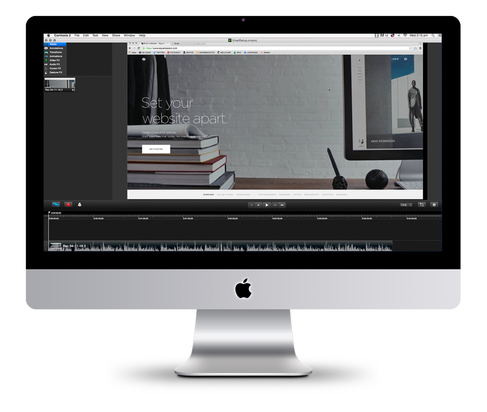
To create my video tutorials I use Camtasia for Mac and Screenflow is another widely used option! I love how easy it is to use, it is super intuitive and I have been able to do everything I need with it. I also use a Blue Yeti Microphone but I would also recommend Audio Technica ATR2100 Mic if you are after something cheaper, but of great quality.

I also provide a comprehensive brand style guide. This helps my clients to be consistent moving forward with their new brand. This really takes the guess work out of brand communication (e.g. social media images, advertisements and blog posts) in the future!


BUILT IN MINI-COACHING

As I have mentioned through this post, a lot of my clients come to me feeling confused and unsure about what to do with their brand and how to move forward. Built into my brand design packages, I help my clients to make good decisions for their brand and give them advice on things like what printing company to go with and how to position their brand. 

My aim with this built in coaching aspect is that my clients will walk away from me confident and ready to tackle anything they can dream up for their brand.


PROJECT CLOSING PROCESS AND QUESTIONNAIRE

At the end of the project, I will always send a final email thanking the client and recapping on what amazing things we created together. I also let the client know that all final files are in their portal and I will provide the URL and password one more time here so that it is easily accessible. I leave the portal online for 2 months from the date of that closing email, and I always make note in that email of the portal delete date (and I schedule it in my calendar too so it's something I don't need to think about!).

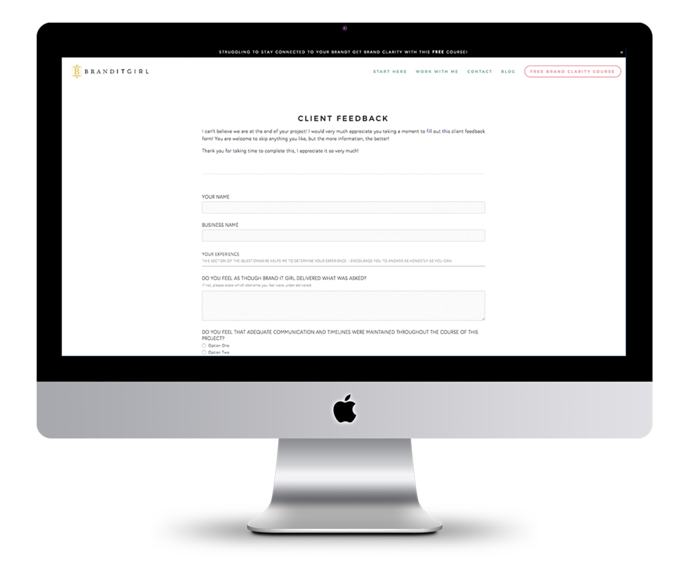
I also send my clients to a closing feedback questionnaire that asks about their experience and satisfaction working with me. This is such an important step for me as I feel that it really helps to strengthen my business - be it if I need to change or modify something, or even if it is reinforcing that I am doing a great job. Whatever the response, it is always super useful and I really appreciate my clients doing this for me! 

In the questionnaire, I ask for a testimonial and permission to use it across my website, social media and communication points. I also ask permission to display their project on my website, blog and on social media. I find that asking people upfront about this stuff is the best way - their info is all in one place, there's no surprises when you share the project on your blog, and they know that you value their privacy and ultimately want to give them the final say!


I absolutely love my custom client project process. Having this process in place has changed the way I operate within my business and means that both me and my client know exactly what is happening when and where!

Working this way can be considered collaborative, and that is exactly what I aim for!

Have you been thinking of hiring a brand designer to help you reach clarity and confidence in your brand? 

I would so very much love to help you. I have spots open in my schedule from the end of May onwards and I would LOVE to talk to you about your brand project! If you like the sound of my process and are looking for a brand stylist and designer that not only creates something beautiful but also someone who can coach you through creating a sustainable brand that connects with the right people, the sounds like we are a match made in heaven!

Jump over to my contact page and shoot me through a message or use this form below and I will get back to you soon!


(NOTE: This post contains affiliate links. This means I get a small financial kick back from them.
I do, however, strongly believe in and recommend all products and services provided here!)

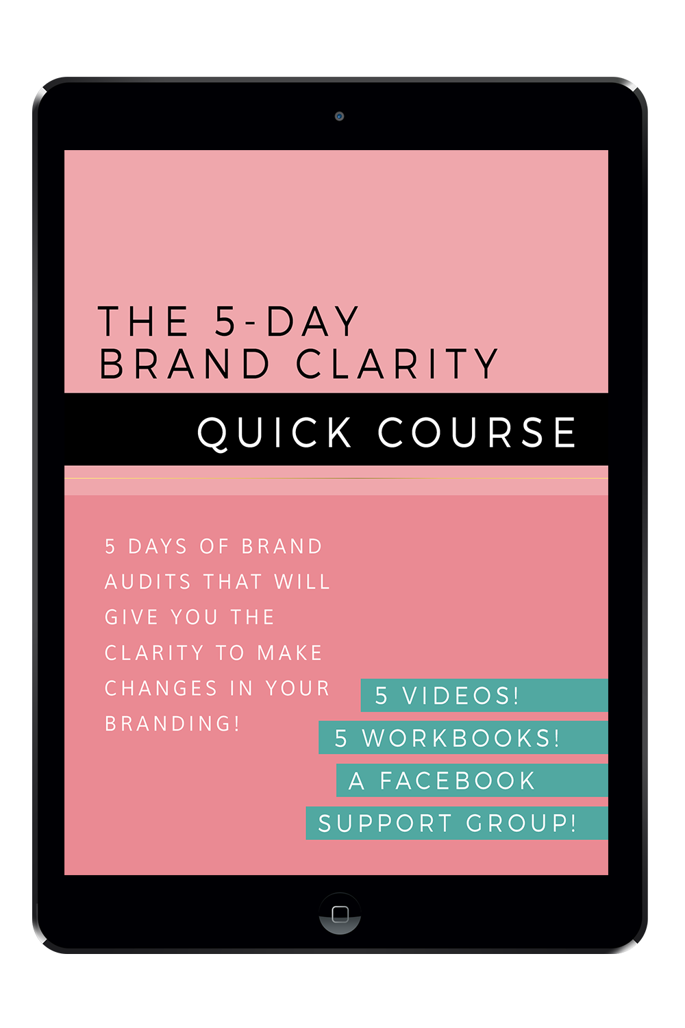
The 5-Day Brand Clarity Quick Course is here!

Since moving my website over to Squarespace, and all the changes I have made lately too, I have been working on a brand new opt-in offer for you. It's a totally free course that is designed to help you reach a point of brand clarity! 

Let me ask you a question?

Do you wake up in the morning and feel a flutter of nervous energy because you know you are living a life that is perfect for you. You know that your brand makes a difference in the lives of others and you are proud to get out of the house and tell everyone you meet about the great mission your brand has.

If not, then I am sad for you. This is exactly how I feel about my brand. And it's how I want you to feel too.

You might be feeling flat, disconnected, uninterested or even embarrassed about your brand - and I don't want that for you! You deserve to have a brand that makes you feel excited and engaged. And while a good brand will never be easy - I promise, growing an amazing brand is hard work - if you're heart is in it and your brand is right for you, it will be easy to put in that hard work.

Let me introduce you to the course. I am so excited to share it with you! There is also a Facebook group you can join and there will be a prompt for each day there! But first, let me tell you what you can expect!


WHAT IS THIS COURSE?

The 5-Day Brand Clarity Quick Course is designed to give a fresh perspective on your brand and where you could be going wrong. The course will shine a spotlight on the parts of your branding that make you feel uncomfortable and will give you ideas for branding elements that you may not have thought about before! The course will also give you strategies and tactics for making your brand identity stronger and more in line with what you and and your target market really wants!

In short, this FREE course will give you the clarity you need to reignite that love affair you should have with your brand. 

And if you are really starting to burn out with your brand - it could just be the very thing you need to save it! 


WHAT DOES IT INCLUDE?

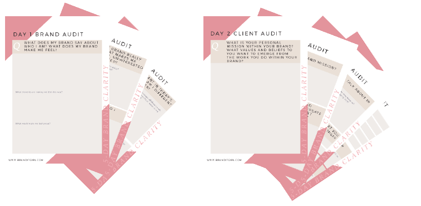
This course runs over 5 days, with an email each day being delivered straight to your inbox. You will find in each email:

  • A video, where I will be talking you through the lesson.
  • A downloadable workbook to accompany each of the five lessons.
  • And a question or conversation prompt that will get you connecting with other participants on Facebook. 

On each of the 5 days we will audit a different part of your brand: 

Day 1: You will conduct a brand audit to get to the bottom of how you really feel about your brand and what that means.

Day 2: With a client audit, you will uncover and solidify what you know about your client and identify any gaps in your knowledge.

Day 3: During this visual branding audit you will assess all aspects of your visual branding, from your logo to your business card, plus lots more like your brand photography.

Day 4: We will then undertake a website audit to discover how you feel about your online presence and identify ways to improve it! 

Day 5: On the last day, we will draw out key strategies for moving forward.

This course is self-directed, so you can start at any time and go at your own pace!


WHO IS IT FOR?

The 5-Day BCQC is for anyone who has a brand! Whether you are just starting out or your brand is established, this course is perfect for everyone. How do you know if it is for you? Well, let's see:

  • Are you struggling to connect with your brand?
  • Did you used to be excited about your brand, but now you are feeling flat?
  • Maybe you feel you are not engaging with the right clients?
  • Or perhaps if you are just starting out with your brand, you just don't know where to start?

If any of these sound like you, then this is the course for you. It will step you through questions, activities and ideas that will give you brand clarity in only 5 days!


WANT TO GET STARTED?


Massive Changes for Brand IT Girl (And HOW I FEEL ABOUT IT)

This year has marked some massive changes for Brand It Girl, with the majority of them taking place in the last 6 weeks. I had been feeling for some time that there had to be a better way to do some of the things I was doing. And some of those old ways of doing things were leaving exhausted and costed me money and time. 

So I woke up. I saw that I could change things in my business that not only made my life a whole bunch easier and more productive, but I could see that the change I was going to make would also help my clients and make their experience with me a bunch better too!

Today I want to recap on the changes I have made to my business system, because I think, just maybe, you might find some value in hearing about what I have done and my thoughts about everything that's going on!


1. SWITCHING TO SQUARESPACE

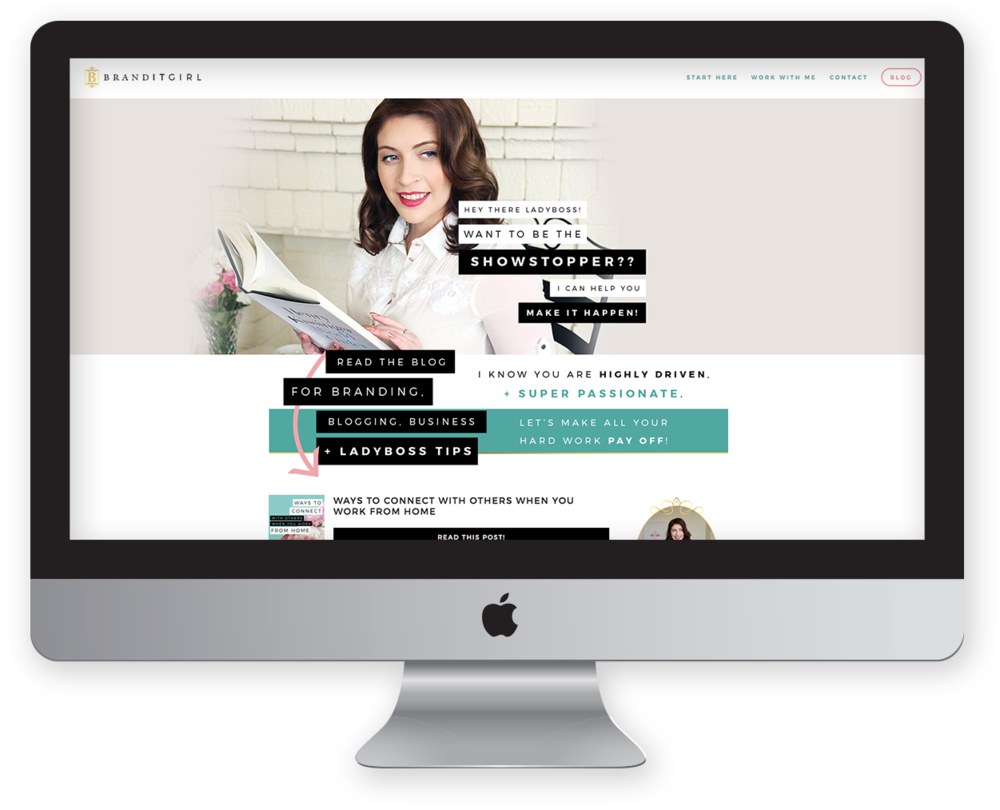
The first big change to my business was that I switched from Wordpress to Squarespace (you can read all about the switch here). I have to say that this has been by far the best decision I have made for my business. Squarespace has changed the way I use my website and I am finding new functions and capabilities all the time that are making my life so much easier!

The best part of Squarespace (apart from the fact it enables beautiful website) is that it is super initiative to use on the back-end and there are endless possibilities using code injections. The only thing I am still trying to get my head around is the lack of plugins - having said that, there is not a single thing that I haven't found a way around! Literally anything you want to do can be done on a Squarespace website and it is making client work so much easier. Squarespace makes it easy to create client websites and smoothly transition ownership to the client once it's done!


When I switched to Squarespace I also pretty much redesigned my website. I really wanted to use the Hayden template but one thing I struggled with was the narrow sidebar for the blog. I previously had so much 'stuff' in my sidebar, the narrow sidebar kinda freaked me out and I spent ages trying to work out coded ways to make it bigger. I did kind of work it out but I ended up embracing the narrow sidebar and saw it as a way to free up that space from the clutter!


2. I GOT MY OWN OFFICE

It was a huge decision to get my own office and while I had been dreaming about ever since I started my business, it felt like the right time. I am still essentially working alone, I am renting an office space and no one else is around. But despite that, I don't feel alone! I am keeping up with all my principles of staying connected and having my own workspace is keeping focused! 

It was a particularly hard decision because I was moving my office out of my Mum's house. I thought working at Mum's would be the perfect in between - technically it is still 'home' but it's not where I sleep and so I thought it would be a win win. And it was - it absolutely served it's purpose and I couldn't be more thankful for the time I spent there. 

However, as I started ramping up my business I encountered a few issues.

  1. The space (my room) wasn't really feeling like Brand It Girl. It is a lovely room, overlooking the backyard, lots of natural light, but it didn't feel like Brand It Girl and I couldn't see how I could convert it.
  2. When I was at my Mum's house, I actually just really wanted to hang out with my Mum! There is nothing I like more than a tea break with Mum, and sometimes it's not the break that's the issue - it's the breaking of concentration and flow.
  3. The third reason was a personal reason, and it might sound crazy but it was a big part of my motivation to move. I felt like it until I took my business seriously, I couldn't expect anyone else to take it seriously. My family are wonderful and supportive but often they don't think my job is a real job - no one ever said it, but that's how I feel. Even when dining with friends, everyone will ask each other how work is going, but no-one would ask me. They weren't trying to be nasty or disinterested but I could tell to them they didn't understand what I was doing. Once I got this office, it was something my friends and family could understand - something that made sense to them. 

So I made the move. I woke up one day, said "Gav, I am going to find an office" and he said "let's do it" because he is the most amazing person I know. And two weeks later, I was moving in! I got all new furniture and while that is story for another day - I can tell you, I spray painted an ikea bookshelf gold. And it's on point!

 
BIG-Office_07.jpg
 

3. MOVING FROM MAILCHIMP TO CONVERTKIT

This was perhaps the hardest change. I love Mailchimp, but moving forward as my business and list grows, I need a solution that is subscriber based rather than list based. What I mean by this is that with Mailchimp, subcribers join a particular list - you can get them all on one list but it takes some work and if you don't do that, then you could have multiple listings for the same person and you can't send newsletters to more than one list etc etc - it just makes the whole thing a little complicated.

I was attracted to Convertkit because it is subscriber based, meaning that it is much easier to manage and the segmentation feature makes it easier to target the people that will benefit most from each post.

One thing I am not loving is the plain-ness of the email templates. Mailchimp make it easy to send pretty emails and while I know emails don't need to be pretty to be effective, being pretty is part of my business mission! I have, however, found a solution - I created a custom template using html and css and I am feeling much more comfortable with the decision!

I can really see the potential for growth with Convertkit and my brand new opt-in offer will launch next week, so stay tuned! 


So those are the massive changes going on behind-the-scenes at Brand It Girl! Lots of great things happening! 

Are you thinking about making some changes of your own? I would love to hear all about it! Post in the comments and don't forget to leave your link too!


Ways To Connect With Others When You Work From Home

I used to work for two really big, bustling companies that literally never slept. Sydney-siders would know of them and people who have visited Sydney would know of them too: Sydney Theatre Company and Sydney Festival. I was completely surrounded by people all the time. I could bounce ideas off other people, I could ask questions quickly and more importantly get responses in real time. I could talk to five different people on my way to making my morning cup of tea. When I made the transition to working from home, everything changed. 

I found myself isolated. Now I don't mean that in a bad way. I thoroughly enjoy being alone, but there is a void when you work from home that is undeniable.

At first, I didn't mind it all. And to be honest, sometimes I still don't mind it! But sometimes that lack of interaction can weigh you down, make you second guess your decisions and make you feel really lonely.

So I started to seek out ways to meet and interact with other people. Now I prioritise connecting with others as a business activity as well as a social activity.

Here are a few of the ways I love to connect with others:

CONFERENCES + EXPOS

I attended the Business Chicks 9 to Thrive expo last year. It was a massive event with hundreds of business women in one place! I walked in and instantly realised these women were just like me. These were my people! I met so many wonderful ladies that day and despite going to the expo alone, I really didn't feel alone!

The best thing to do at a conference or expo is to just get out there and talk to other people. Everyone is there for the same reason: to network and connect with others. Sometimes it is hard to remember that, and it can seem scary walking up to a stranger and asking what they do for a living, but that is exactly what you should do! A few other tips:

  • Take a stack of business cards and give them out!
  • Dress the part and embody your business mission. Looking the part leads to feeling the part, so plan your outfits and never wear uncomfortable shoes. There is a lot of standing up!
  • Take a notebook to jot down inspiration. Conferences and expos are full of things that will get your creativity tingling, so be prepared to take some notes if inspiration strikes!

Some other conferences you might like to check out include: Bloom The Workshop, Altitude Summit and Creative At Heart.

FACEBOOK GROUPS

One of my favourite ways to connect on a daily basis is through Facebook groups. I am a member of a bunch of groups and while my attendence fluctuated depending on my schedule, I try to post as often as possible.

People use Facebook groups for a variety of reasons:

  • To seek advice and ask questions.
  • To connect with others by answering questions and sharing knowledge.
  • To promote a project, product or website.
  • And most importantly, to build meaningful relationships with people just like yourself!

You can find Facebook groups in your niche by simply typing: YOUR NICHE FACEBOOK GROUPS into Google or directly into Facebook search. Some of my favourites include: Blog + Biz BFFs and For Love + Money.

WEBINARS AND VLOGS

I feel a little bit like a fraud by saying this, because I haven't actually created any Vlogs or hosted any webinars, so let's rectify that problem right now! It's super short!

SKYPE MEETINGS

A great way to connect with others, especially those that live a long way away from you, is to set up Skype meetings. If there is someone you want to get to know, I encourage you to drop them an email and explain that you are interested in their work and what part specifically grabbed your attention. Tell them a bit about yourself and propose a Skype session to get to know each other a little better.

My favourite way to do this is to suggest a few dates and times and allow the other person to select what works best or offer a counter time. Let them know you will be making a cup of tea or coffee to bring along and have a nice little introduction chat. Keep it short, about 15-20 minutes is a great length of time.

Skype meetings are also a great way to get to know potential clients. Spending only 10 minutes on a Skype call will make it clear to you if you are able to work with someone and if you can truly help them. You can get insights into their personality, attitude and expectations far quicker than you can through email and for the client, it makes you a person rather than a robot on the other end of email. 

SHARING PERSONAL STORIES

Lastly, your blog is actually a great place to connect with people. By sharing your own stories to illustrate the topics you are writing about, you give people a glimpse into your world and they automatically feel more comfortable and connected to you.

This doesn't mean spilling your secrets, or worse, oversharing information about yourself. I simply mean share your own experiences instead of writing only in abstract terms. There are a few really strong reasons to illustrate blog posts using personal stories:

  • Stories help to make the topics you write about stick in people's minds - they start to feel that they heard the story from a friend rather than just reading a faceless blog. 
  • Sharing stories builds trust and authenticity. Readers are constantly making judgements about the value of what they are consuming online, personal stories reinforce your writing with solid proof of what happened in real life.
  • Stories help to keep reader attention for longer. When I am listing to speakers at conferences or at training courses, I always remember the speakers that tell stories. They keep my attention throughout and it says in my mind - what more could a speaker want!


Working from home absolutely has it perks. Like when you just can't be bothered getting dressed, for instance, is a huge plus! But there is also another side that can leave you feeling quite alone and unsure. But honestly, since I started making connecting with others a priority, I enjoy my isolation again because I know it's not long until another opportunity for interaction will be on my doorstep. 

LEAVE YOUR URL IN YOUR COMMENT SO I CAN VISIT YOU BACK!

Starting Out With Squarespace

I have been a proud Squarespace user for almost two weeks now, and I honestly couldn't be happier. It was a sudden shift. I was such a Wordpress warrior for so long but day I jumped on Squarespace and took their 14 day trial and before I knew it, I had not only rebuilt my website but also improved it. This platform is without a doubt the best one for me and I really do think it could be the one for you too. So today I wanted to talk you through starting out with Squarespace and give you a guided tour of the 'switching over' process.

I know moving your website can seem like a mammoth task, and I am not going to lie to you, it's a big job but in the end, making a change might be the exact thing your businesses needs. I am going to talk you through choosing your plan, transferring over from your old website (particularly if that website was a self-hosted Wordpress) and give you an overview of choosing a template, with a very brief walk through of your settings and metrics. By the end of this post, my hope is that you will have everything you need to start your Squarespace website! Let's get going!


CHOOSING THE RIGHT PLAN FOR YOU

Squarespace offers three different hosting products: cover pages, websites and commerce sites. They vary in price points and in what you can do with them, so it's important that you take a minute to consider each product and determine what's the best option for your needs. I recommend choosing the billed annually option offered on which ever product you choose. It reduces the price dramatically. The only time I would advice against this is if you chose a cover page to promote something for a short period.

Squarespace - Cover Page Pricing

Cover Pages

A Cover Page is a one-page website. This option is great if you are promoting a project or product or if you would like to create a landing page to collect email addresses. It is a simple option that still looks amazing and professional and the great thing is you can add an image, some text, buttons, and media really easily. Mobile responsitivity is also built in, so it's a great option and might be a cheaper solution than something like Leadpages if you only need on page.

Websites

Squarespace also offers websites on two different levels: personal and business. On both these levels you will have access to all cover page layouts too so you can still make these pages when you sign up for a website plan. I would recommend a website plan for most people but just pay attention to the two levels and the number of pages and products you can have!
Squarespace Pricing - Website Plans - Personal and Business

BUSINESS

This is the level I use and it provides a huge amount of options with the ability to have 1000 pages. You can sell up to 25 products which is a great place to start (and you can always upgrade later!).

PERSONAL

The Personal plan is well-suited to smaller sites. I personally think that this might be a little limiting if you are planning on growing and expanding your business, however for some businesses, this is absolutely enough! You can have 20 Pages and sell 1 product. 

Commerce

The Commerce options may be more appropriate for small retailers that have over 25 products on offer. These websites have eCommerce at the heart of their purpose and if you select the commerce option, you will also have access to Website and Cover Page templates. This might be something that you upgrade to from the Website plan as your business grows.

Squarespace Pricing - Commerce Plans - Basic and Advanced

ADVANCED

Perfect for larger eCommerce stores that process many orders and need advanced shipping and marketing options. On this level you can also sell unlimited options but you are also given a wide range of marketing and eCommerce options and integrations.

BASIC

This is a great option for smaller business and retailers that don't need advanced integrations for shipping and marketing. You can sell unlimited products on this level and are offered eCommerce options like label printing and accounting.

If you need more information about pricing, you might like to check out the Squarespace pricing page or the Squarespace Help guide to pricing.


CHOOSING YOUR PERFECT TEMPLATE

So you may have already played around with one or templates when you started your free 14-day trial but when it comes time to actually choose one, it can be a bit daunting knowing which template to use for your site. Spend some time looking over all the templates and maybe even reading reviews. If you click on a template and scroll down, you will see live examples to websites that have used that same template and the different ways you might be able to style it. 

The main thing is to choose one and settle into it for now. If you change your mind later, it's ok, you can change your template any time! I use the Hayden theme for my website, but some others that I love and have heard good things about include Bedford and Galapagos.

Note that not all templates have the ability to add a sidebar to your blog. The current templates that offer this are:


SETTING UP YOUR SETTINGS

Once you have your plan sorted and the template you are using picked, you will need to sort out your settings section!

Start by filling out your basic information. Head to Settings and fill in your business name, description, add social media accounts, add an email address and update your SEO settings. You don't need to install any extra SEO plugins, so Squarespace makes this process super simple. You just need to head to Settings > Marketing > SEO to enter a description for your website!
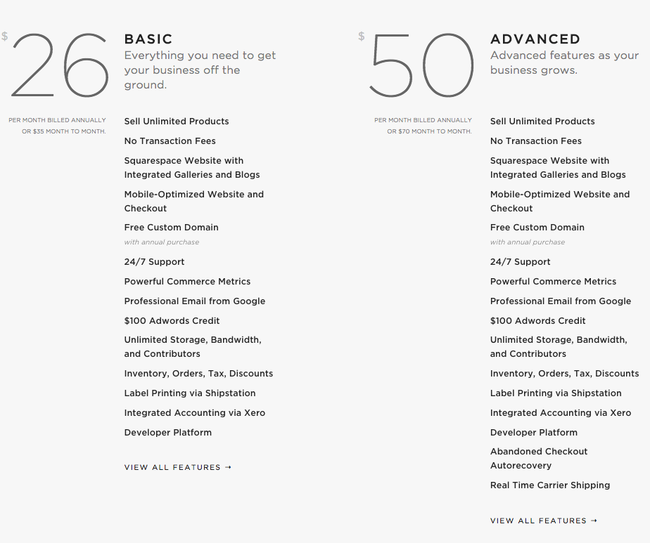

INS + OUTS OF TRANSFERRING TO SQUARESPACE

Let's talk about the big scary topic of transferring your website to Squarespace. Well, I am sorry to disappoint but it was a SUPER smooth process for me and it can be for you too. People would honestly really scare me when they would talk about the complexities of moving a website, all the things you needed to do manually and what you would lose. I want to squash all of that right now and tell you it was really easy, super quick and I didn't lose anything!


Transferring Your Content

So let me tell you about a magic tool that made this whole thing easier. 

If you are switching from Wordpress to Squarespace, there is a nifty way to import all of your content from your old website to your new one. Login to your Wordpress dashboard and navigate to Tools > Export > Export. Select All Content and the hit the Download Export File. This will save an .xml file to your computer and it's this baby you'll be using to move all your content over.

Over in Squarespace you navigate to Settings > Advanced > Import/Export. Click the Import button and select that .xml file from your computer. This will move over all your content from the Wordpress site to your new Squarespace site. Note that there is a direct Wordpress Import option on that page. I recommend doing the manual export/import to save time and ensure you have a back up of your website.

Once you have completed the import you will need to activate the content you uploaded. Head to Pages > Not Linked and you will find your imported pages. Notice that when you hover over a page name, a small settings toggle appears. Click this to open your page settings where you will need to check the enabled option before pressing save. You can leave the pages here in Not Linked, however you can also drag and drop the pages to appear in the navigation areas.


Transferring Your Domain

Once you have your content all installed and your website looking top notch, you will want to transfer your domain over to point to the new website. If you are starting from scratch with a new URL this will not be relevant to you, but for those people wanting to keep their domain name, you will need to point your domain to Squarespace. This means you would be using a domain hosting company like JustHost, GoDaddy or BlueHost for instance, and it is important you don't close or cancel this account - you will lose your domain name if you do!

Go to Settings > Domains > Connect a Third Party Domain and you will be prompted to enter your domain name. So this will be your www.yoursite.com url (for instance, mine is www.branditgirl.com). Once you have entered this, click continue. You will be asked to select your domain provider from the list. Once you have done this, simply hit Connect Domain and a message box will let you know that the connection is in progress.

Once you have connected your domain, a panel will display a set of records. You will need to update your domain host DNS details in order to connect your URL to your new Squarespace site. 

 
DNS Settings - Squarespace
 

Log into your domain provider's site, and find where you manage your DNS settings. Depending on your domain host, this could be called Zone File Settings, Manage Domains, Domain Manager, DNS Manager, or something along those lines. Once you locate this section, you will need to create these records. If you need more info about this, you can take a look at Squarespace Help's tutorial here.

Note that you will need to give it some time. I know how frustrating it is to wait and when I did my switch, there was a moment of panic when I realised it wasn't working on all devices a couple of hours after I made the switch. Give it around 24 hours before you panic, and when you do panic, the Squarespace support team are amazing and can either reassure you that the switch is on schedule or they can instruct you on what to do to get it going!

When the green correctly linked label appears under your domain name in the Domains penel, you know that everything has worked. But still give it the 24 hours to be working at 100% capacity!


Creating Redirects with URL Mapping

So everything else up to this point is super simple and smooth when transitioning to Squarespace, however there is a slightly more annoying part but let me just reassure you - this part took me half an hour from start to finish, so it's NOT HARD. 

After the 24 hour waiting period to transfer your domain name to your new website, you will notice that some of your blog post links on things like Pinterest and Facebook are going to a 404 error page. This is because, even though you have your website url pointing at the new Squarespace site, the urls look a little different.

When using Wordpress, my blog posts looked like this:

http://branditgirl.com/blog-post-name

Now in Squarespace, they look like this:

http://branditgirl.com/blog/blog-post-name

The difference is that Squarespace create a blog sub-folder meaning that when people click on your links out there on the internet, they will not be taken to the post in the subfolder. 

Don't fear! This is really easy to fix. Head to Settings > Advanced > URL Mapping and you will see an area where you can redirect broken links to their new homes. URL mapping looks like this:

/old-url -> /new-url 301

So let's do an example together:
 

/blog-post-name -> /blog/blog-post-name 301

Breaking this down for you, the first part is the old URL, leaving out the website name. Then you have an arrow to indicate the redirect and then the new url, in this case including the /blog/ subdirectory. The 301 at the end indicates that it is a permanent redirect. Don't forget to save it when you are done and you can come back and add redirects at any time.

If you need more information on this process, you can find a super handy guide from Squarespace Help!


And that's it!

You are all set up and ready to go. Starting out with Squarespace is really not as hard as you might think, so stop letting that be an excuse to slow you down! 

Stay tuned for more Squarespace tutorials and guides and I am happy to take requests for specific Squarespace tutorials if there is something you want to learn! So feel free to post any requests in the comments!


So... I Made The Switch From Wordpress to Squarespace

It's been a crazy 2 weeks here at Brand IT Girl HQ. I decided after much consideration, research and umm-ing and ahh-ing to switch from a self-hosted Wordpress to Squarespace as the home for my website and blog.

It was a mammoth decision for me, but to be honest, the simplicity of the switch really showed me that this was a fantastic decision.

Now let me be totally transparent. I was NOT a Squarespace fan. At all. I was actually kinda anti-Squarespace. And I honestly thought I had some pretty solid reasons. Things like the lack of flexibility and the fact you have to choose from the SS templates for your site. To be honest, it made me feel like a bit of a fraud. I mean, I am a web designer and I thought, in my very naive mind, that SS designs weren't 'real' web designers. I know, that's really harsh of me, but I want to be honest with you here and that's honestly what I used to think. But guess what: a week into my Squarespace trial and every single thing I thought was a problem or an issue was dis-proved. Squarespace literally sold itself to me!
So as I said, I created a trial page and I thought "Ok, you have the 2 week trial to create the site" and my goal was to recreate my old Wordpress site. Well I not only recreated the old WP site, but I made some great changes and totally fell in love with my website all over again. So let me share with you what I really love about SS!
WHAT I LOVE ABOUT SQUARESPACE

THE LACK OF ENDLESS CHOICES

It's funny because this was one of the major things that was keeping me away from Squarespace to begin with. I thought that the lack of choice was a huge issue, something that would stop me from creating the website of my dreams. It just isn't the case! The lack of endless choices makes it simple to 'get on with it' and stop procrastinating. Once I settled on my theme (which is the Hayden theme), I was able to create my website quickly and efficiently and this is largely thanks to the fact that I was not given endless opportunities and choices. 

CUSTOMISATIONS ARE POSSIBLE!

I was actually pleasantly surprised that pretty much everything is customisable and if you are a web designer who is thinking you won't get the opportunity to flex your coding muscles - think again! The custom CSS function makes it possible to customise and change pretty well anything on your Squarespace site. I changed so much of the Hayden theme by writing my own custom CSS.

SUPER EASY TO CREATE STUNNING PAGES

From a web designers perspective, Squarespace is a ridiculously dynamic tool for creating absolutely beautiful pages quickly. The drag-n-drop features make it really easy to build pages that look professional while also offering all the options you would find on the Wordpress editor.

SECURITY

Ok, so this is a huge one for me. My Wordpress was hacked on more than one occasion and let me tell you, what a freaking headache. So when I started to look into the security advantages of Squarespace, I must say, it was a huge draw card for me. I don't want to have to be concerned with the security of my website - I have plenty of other things to worry about - so feeling more comfortable in this department is a big plus.

BUILT IN SEO

I am pretty bad with the whole SEO thing, so having it all built in is a huge advantage. I love that I don't need a third-party plugin for SEO, honestly, trying to work out the best plugins for all my needs is a hassle, so having everything in one place takes the guess work out of it!

So there you have it - my big switch from Wordpress to Squarespace! I am so happy I made the change! But I do want to make something clear: I still absolutely LOVE Wordpress. I don't want to be one of those designers that diss one platform for the other. I am a huge fan of Wordpress and I will continue to work with, create and sell Wordpress themes. But there may just be an addition to the shop (hrm, think Squarespace kits!).

Why Your Business Needs a Blog + What NOT To Do!

Why Your Business Needs A Blog (and What Not to Do!)

I was recently swanning around on Facebook and someone asked the question if you need a blog for your business. Now, I know that this is a subject that has been widely debated in the blogosphere and I wanted to weigh in with my opinion on the matter.

My initial answer is no, you don't need a blog for your business and in some cases it will not help your business one little bit (but more on that in a moment). However, I do believe that if done properly, a blog can be a powerful tool for growing your business! There are a variety of reasons why a blog is a great idea:

ESTABLISH YOURSELF AS AN EXPERT IN YOUR FIELD

A blog will help to establish you as an expert in your field. As you share knowledge of your craft and industry, people will learn to trust you and look to you for answers to their questions. This is invaluable for your growth as a business and as an industry leader. Trust should be your paramount aim and blogs are brilliant at building that trust! When you generously give knowledge and information in an authentic way, people are drawn to you and it can really break through the noise of a busy market place.

BUILD A COMMUNITY/TRIBE

Blogs assist you to develop your own community around your product, service and brand. This is often referred to as 'building your tribe' and essentially means bringing people with a similar interest, lifestyle or industry together in a dialogue that is meaningful and enriching in some way. This could translate into growing and nurturing an email list, a community on social media such Brand IT Girls Connected or starting a conversation on your blog through comments. Blogs give your community a chance to get to know you and what you are all about without having to heavily invest in you first, ensuring that you are attracting the right people who truly understand what your business is all about!

DRIVES NEW TRAFFIC TO YOUR WEBSITE

Another key reason to start a blog for your business is that it will drive traffic to your website. Keeping your blog on your business website is recommended as it will help to streamline this process of driving traffic and you can seamlessly to link your products and services in your blog. A blog will give potential customers more reasons to visit your website beyond just to seek out information on your products and services. It's a rich touchpoint for customers to engage with you before they even start to consider making a purchase, and blog posts give you valuable things that you can post to your social media.

IMPROVES YOUR SEO

Improving your search engine optimisation means that people are more likely to find you, as it helps you to rank higher on search engine results. Each blog post can be search engine optimised, with information that boost your rankings found through the blog post and in the images you post.

BrandITGirl_SidebarDiv.png

At the beginning of this post, remember I warned that if it's not done properly, blogs could have a negative impact on your business? Well let me tell you what not to do if you are considering adding a blog to your business website.

  1. Don't just do what everyone else is doing. A good blog will have something unique to offer readers. Be sure to differentiate yourself and your business by looking beyond current trends and thinking outside of the blog. What blog post series can you do that are unique to your business and your ideal customer? How will you present your blog posts in such a way that your customers are excited to engage with you?
  2. Don't blog about EVERYTHING. It is important to narrow your focus down to be specifically relatable to your business offering. So for instance if you are a nail artist, do not blog about cooking and recipes too. Keep your topics clear and focused to resonate with the right people. Quality of quantity remember - you are better to have a small engaged audience rather than a large audience that is only interested in some of the things you write about!
  3. Don't blog for everyone. You can't please everyone. In fact, I am a firm believer that if you are trying to be something to everyone, you are nothing to anyone. My recommendation is to blog for your ideal audience - the people that you really want to engage in conversation. The people that will help your brand to grow, who will buy from you and who will be a cheerleader down the road for your products and services. You can only do this if you are specific about who those people are!
  4. Don't keep changing your style. This is one of my pet hates. If you start a blog, be very clear about your style and stay consistent! Yes, style does evolve over time, but if it does, take the time to update old posts to reflect this. I am talking about the way you speak in your blog posts, the images you use and the graphics, fonts, colours and conventions. This doesn't just make your blog look pretty, it also (and more importantly) ensures that your readers know what to expect and can consume the content easily without having to adjust to new visual environments.

So there you have it, I absolutely believe in the power of a blog for your online business. But on one condition - do it right! I encourage businesses to hire a designer and have a blog style guide created based on your existing brand and consider your blog post content strategically.

Are you thinking of starting a blog for your business?
What are you struggling with? What questions do you have?

You're Not A Fraud (+ 7 Steps To Kicking Imposter Syndrome)

You're Not a Fraud + 7 Steps to Kicking Imposter Syndrome

So you are an imposter hey? Let me guess:

"You don't have a clue what you are talking about"
"Who are you to teach other people about this?"
"That was just a fluke, don't let yourself think that it will happen again!"


Any of those self-talk statements sound familiar? I am sure they do and it's called Imposter Syndrome. It's that feeling that you don't know what you are doing; that you couldn't possibly be qualified enough for the job at hand (regardless of how qualified you actually are!); that any successes that you do have are a fluke, a mistake or happened 'by luck'. It's that little niggling voice in the back of your mind that tells you to stop what you are doing because "let's be honest, you are a fraud".

My darling love bug, you are not alone.

It's an IT Girls job to be confident, secure and in control, right? Sorry to disappoint, but I am human too and let me tell you something: Imposter Syndrome is an actual thing and it effects effect hundreds of thousands of people! A study in the 1980s estimated that two out of five successful people actually identified themselves as being a fraud. That is a huge figure and today, with the rise of technology, it's only increasing! Other studies conducted found that 70% of all people feel like impostors so when you start to look at those kinds of figures you realise that all those feelings of inadequacy and fraudulence doesn't make you weird - it makes you a member of a pretty large group of people! Let's look at what Imposter Syndrome actually is!


IMPOSTER SYNDROME

Imposter Syndrome was identified by clinical psychologists Dr. Pauline R. Clance and Suzanne A. Imes in 1978. This issues occurs when high-achieving people have a continual and persistent fear of being exposed as a 'fraud' regardless of the evidence that they are in fact the real deal! These individuals think that they do not deserve the success they experience and will often attribute it to 'luck', 'deception', 'good timing' or even 'magic' and 'divine intervention'. There is also evident that suggests that Imposter Syndrome is particularly common in women and so, being lady bosses, we need to shine a light on this and move forward together as a community!

The really weird thing about this problem is that it is most prevalent among high-achievers. Even some of the most influential women that so many of us look up to get attacks of Imposter Syndrome. Need proof? Actress and UN Ambassador Emma Watson on numerous occasions has said that she feels like an imposter (read an interview with her here) and she is not the only one! Seth Godin wrote in 'The Icarus Deception' that even he still feels like a fraud despite all the incredible work he does and the books he has published. You can also read this great article full of celebrities that struggle with this!


WHAT MIGHT IMPOSTER SYNDROME LOOK LIKE ON YOU?

FEELING LIKE A FAKE | You might be shying away from potential clients, finding yourself essentially talking them out of engaging your services or buying your product for fear that you will not be able to deliver what they are expecting - regardless of your skill level and/or product quality. You might also find yourself saying to family and friends that you can't believe a new achievement and it was just a fluke: "I have everyone fooled! What if they realise that I am not what they think I am!?".

NOT CHARGING ENOUGH | This could be seriously hurting your business! It's when you don't believe that what you have to offer is worth as much as it really is! You might discount products and services because you don't think anyone will pay what market value, or you can't identify the worth of the work because you don't believe you know enough or have enough skill to justify it!

PARALYSIS | You sit down at your desk, ready to go and you can't function. Like there is nothing but scramble. You can't focus on any one task, you can't finish any projects, your to-do list is never any shorter and you are completely and utterly paralysed.


SO WHY ARE YOU QUESTIONING YOUR AWESOMENESS?

There are a variety of reasons that you might suffer from Imposter Syndrome, or perhaps you just have elements of feeling like an Imposter. Attitudes and beliefs of others - we are endlessly impacted by the messages that we receive from others, be it direct or indirect.

Our parents and partners have a huge impact on our sense of self worth. Often feelings of imposition and fraudulence can come from family situations and dynamics. If the aspirations of an individual conflict with family expectations it may result in imposter feelings. For instance, if a young woman wants to become a mechanic, she may be met with resistance by her family based on their expectations of gender and this can deeply impact self-worth. Family labels can also have an impact: for instance some families label one child as the 'intelligent' one while the other is the 'sporty' one for instance. This may result in the 'sporty' child to grow up believing they are not intelligent, regardless of their great academic achievements in later years.

Partners and significant others also have an equal impact on the development of Imposter Syndrome. Being undermined in a relationship, being told you wouldn't understand or repeatedly being told that you can't do something will also harbour self-limiting beliefs. While a vast majority of the research points to external factors impacting on the development of Imposter Syndrome, it doesn't mean that we can bury our heads in the sand and just accept it!


HOW TO KICK THE IMPOSTER MINDSET

While I still haven't found a way to kick it entirely, (and I do wonder if these thoughts ever really go away once you get them) there are definitely things you can do to minimise the hold that it has on you!

  1. BECOME AWARE | It sounds really simple, but honestly, becoming aware of your self-limiting beliefs, thoughts and imposter tendencies will really help you to monitor the control that these feelings are having on you. Acknowledge that they exist and make a conscious decision that they won't be controlling you today!
  2. SUPPORT | Being able to verbalise your feelings of being a fraud is really important. That person can help you to dispel feelings that you are somehow less that the magnificent creature you are. It might be a friend, family member or even a professional such as a councillor. There are so many incredible Facebook communities out there of women just like you that feel the same! Check out the Brand IT Girls Connected community - feel free to post your struggles and we will pull it apart with you!
  3. REFRAME FAILURE | Seeing failure as an opportunity to learn and grow rather than as a big fat stupid you mistake is really important. Train yourself to use the phrase: "It didn't work out, but here's what I learnt...". Mistakes don't make you - it's what you do after than impacts who you really are. So reframe the notion of making a mistake from something that is soul crushing to being an opportunity for growth and development.
  4. WRITE IT DOWN | Keep a journal of everything you DO succeed at and all the great achievements you have. Reading back over the incredible triumphs you have had will help to rewire this self-limiting mindset. Nesha at Nesha Designs calls this a success log, and I absolutely LOVE that idea. She recommends writing it down every time you reach a milestone or have a great win personally and for your business.
  5. DISCREDIT | When you feel that self doubt creeping in, write it down too and then reflect back on all the positive things and discredit the imposter feelings by listing why it can't possibly be the case! Listing everything that you are good at and why is a great way to discredit these thoughts and often by the time I get halfway through that list, I have forgotten what I was initially feeling like a fraud over!
  6. DRESS THE PART | Dress, talk and walk the part that you want to play. This is a controversial one, but I truly believe that when you dress the part, you feel a particular way and this will have an impact on your perception of self! Sarah over at Career Contessa talks about this saying that if you act confident enough you will start believing that you are!
  7. VISUALISATION | This is something I am practicing more and more - I will visualise myself being confident, succeeding and achieving the things I want to achieve. I write this down because it is proven that writing it down gives the visualisation more power. Write down exactly what you want and what you want to feel in as much detail as you can!

MY CHALLENGE TO YOU

Try one of these 7 Imposter Syndrome mindset shifters each day for a week. Put all your focus into each specific mindset shifter each day and see the difference you experience after a week! Head over to the Brand IT Girls Connected community and share your experiences each day. I will be there to help you along the way!

Introducing: The Brand IT Girl Resource Vault

Brand-It-Girl_The-Vault_Blog-Post

I am super excited today to introduce to the newest addition to Brand IT Girl: The Brand IT Girl Resource Vault.

I want to offer all of my readers exclusive, FREE access to this library that includes all of my blog post giveaways. So will find everything I have ever offered as a blog freebie plus anything I will offer in the future and you'll be able to access it all in one convenient place using a password.

I know you are wondering how to get hold of the password for vault page but first I want to give you a little sneak-peak at what you can expect to find in there!

Brand-It-Girl_The-Vault_Page-Screenshot.png

If that isn't enough to get you as excited as I am, you will find new additions to this library on a regular basis. The best thing is, you only need to get the password once! Worried about forgetting it? Don't be! I will include it at the bottom of all my eNewsletters so you will easily find it again when you spot a new freebie that you want!

HOW DO YOU GET ACCESS?

IS THERE SOMETHING YOU WANT TO SEE IN THE VAULT?

I would love to hear from you! Let me know what you would like me to create for the Brand IT Girl resource Vault!

How To Add Multiple Instagram Accounts And Switch Between Them!

How to add multiple instagram accounts and switch between them

Finally, the time has come! Instagram has just released a new update that allows you to add up to 5 Instagram accounts and quickly switch between them without having to log out and log back in. Can we all just take a minute to thank the universe! I can honestly hear a collective gasp of excitement! They started the beta testing on randomly selected accounts over the last week and finally they have announced that it's game on! So let's get you set up for multiple accounts!

HOW TO MAKE THIS FEATURE AVAILABLE

  1. Firstly make sure that you have the latest Instagram update installed on your mobile device.
  2. Once you have done so, close the app by double clicking on your home button (if you are using iPhone) or tap and hold on the app and swipe it to the right (if you are using Android).
  3. Reopen the add and you should be ready to go!

HOW TO ADD MULTIPLE INSTAGRAM ACCOUNTS

  1. Go to your profile and tap on the gear symbol in the top right-hand corner
  2. Scroll down through your settings menu and tap Add Account.
  3. You can either enter the username and password of the account you'd like to add or create a new account at the bottom of the screen.

HOW TO SWITCH BETWEEN ACCOUNTS

This new Instagram upgrade makes it super easy to switch between accounts!

  1. Go to your profile
  2. Tap your username at the top of the screen and a dropdown menu will appear with all your accounts visible.
  3. Select the account you'd like to switch to and Instagram will change profiles for you.

You can add up to 5 accounts and they are 100% independent from each other. You will have completely separate Instagram feeds and different user profiles too. I hope that you are as super-freaking-excited as I am about this new addition! Go, make multiple accounts, and be merry!

DO ME A FAVOUR!

Share this post!!

We want to as many people as possible to know about this new Instagram feature so let's get it out there!

multiple instagram accounts are here